A little honesty…
I’m always going to be honest try to be honest with you (sometimes, my photos lie…no filters, just changes of angles to make me look a little slimmer). So, with the idea of being fully transparent, I’m going to admit I was just too cold and too lazy to take photos for a post today! Then, I thought…a tiny house tour would be a good thing. Why tiny house? Because of SEO, of course! SEO is search engine optimization, it’s something your strive for as a blogger. You want your posts to pop up should someone google a phrase or title.
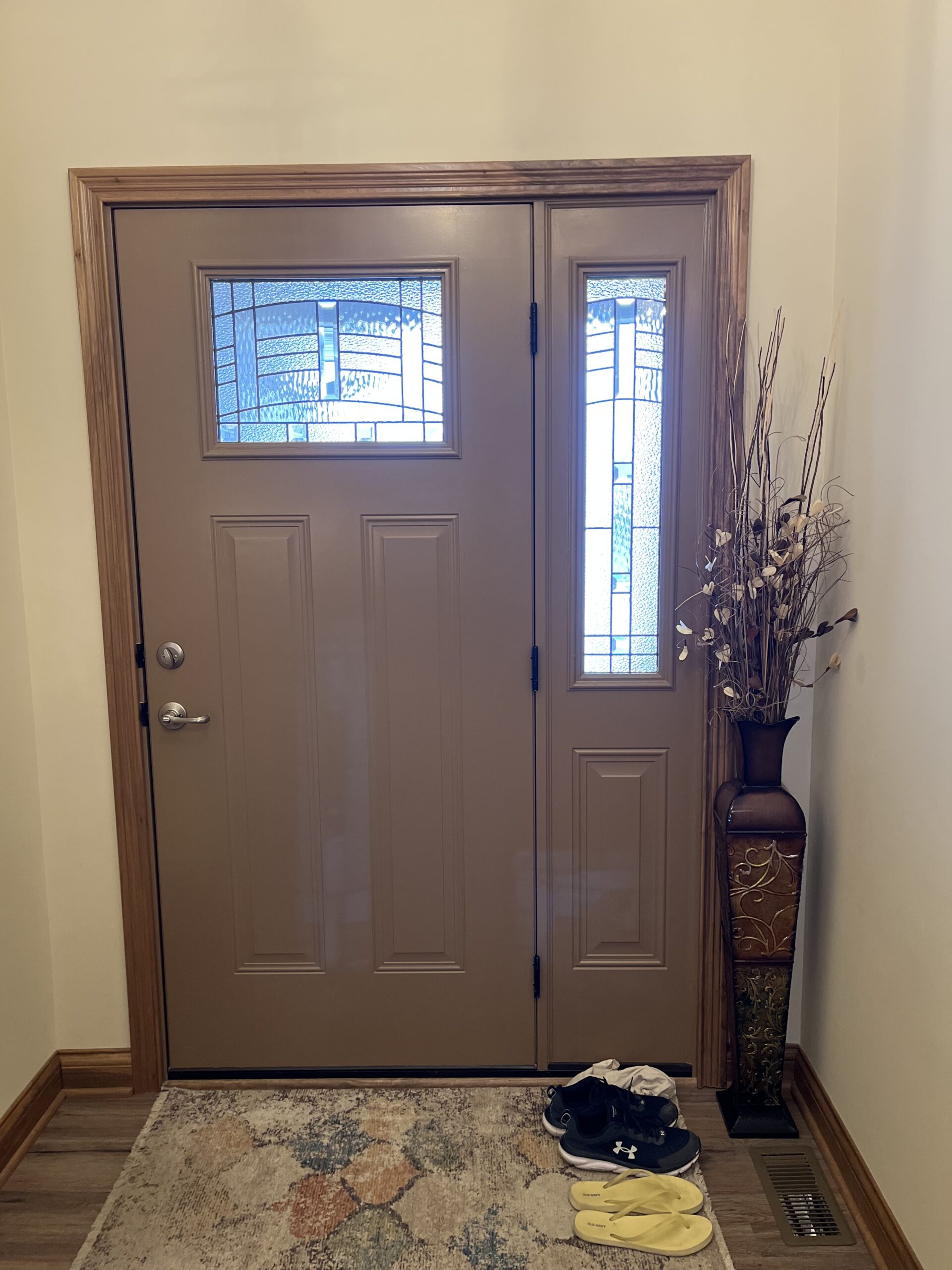
The front hall…
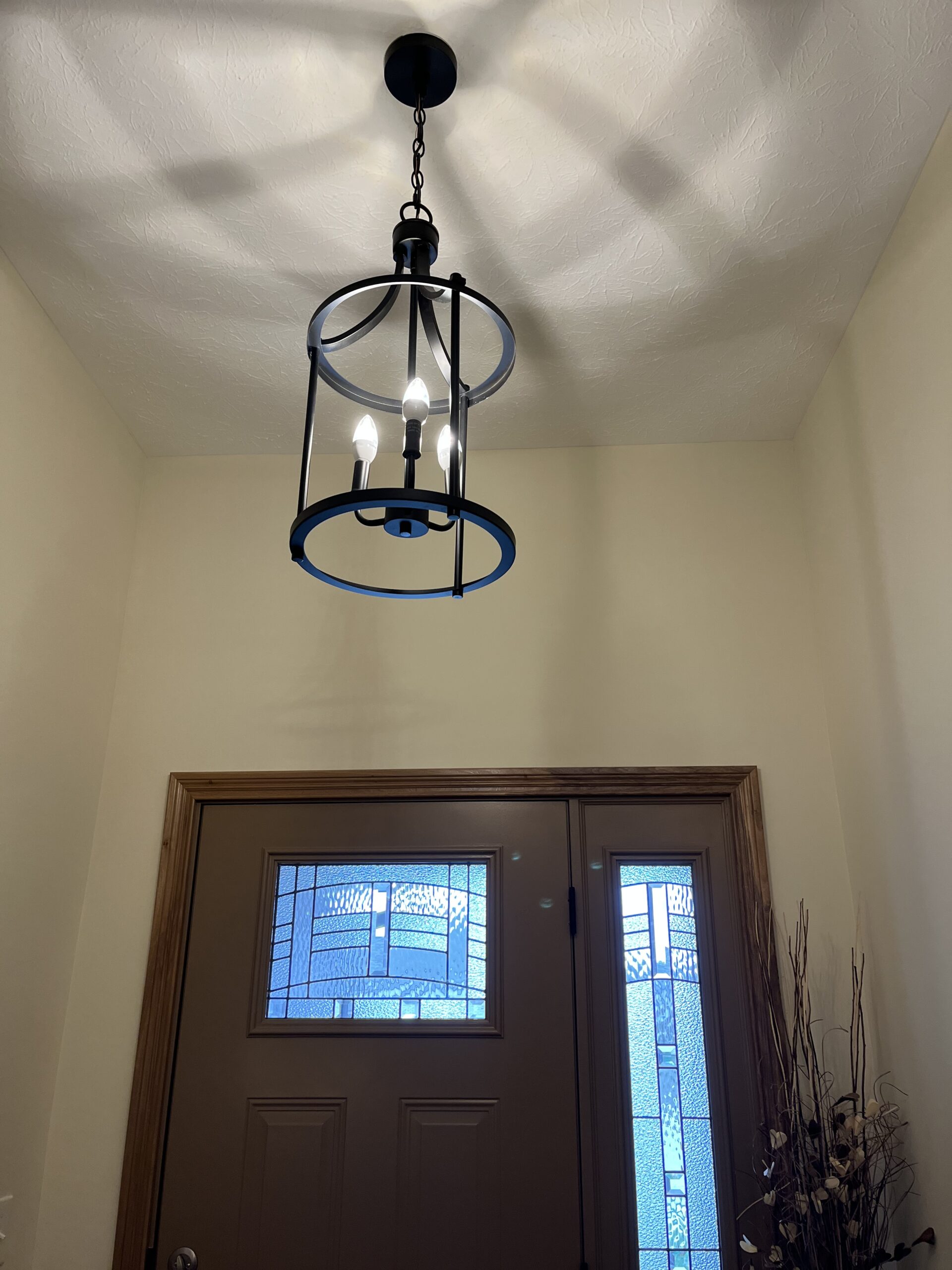
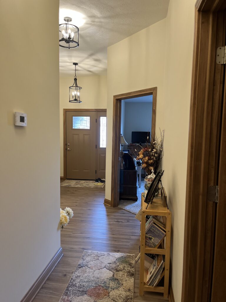
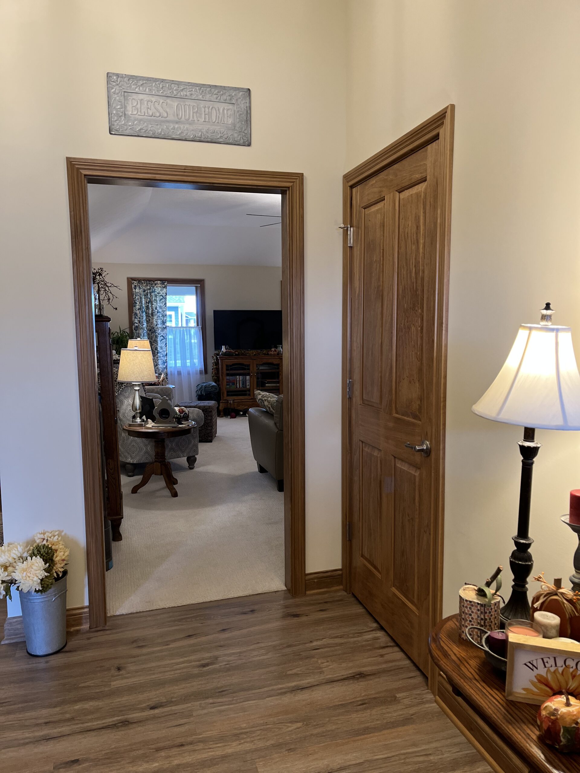
It’s funny. Nigel and I worried and wondered about the lights for the front hall for weeks. We opted to be our own designers rather than work with the lighting guy our builder has (yeah, I peeked at those prices). The funny thing is these lights are rarely even on! The hallway is 10 feet tall and about five or six feet wide (too lazy to dig out the tape measure or the plans). Anyway, there’s a lot of real estate there (unless there’s a beloved and now gone purple loveseat there). The front hall actually goes to the back bedroom so it’s more than just a front hallway. It takes a little zig (or is it a zag) to the left for some reason.
Then and now…
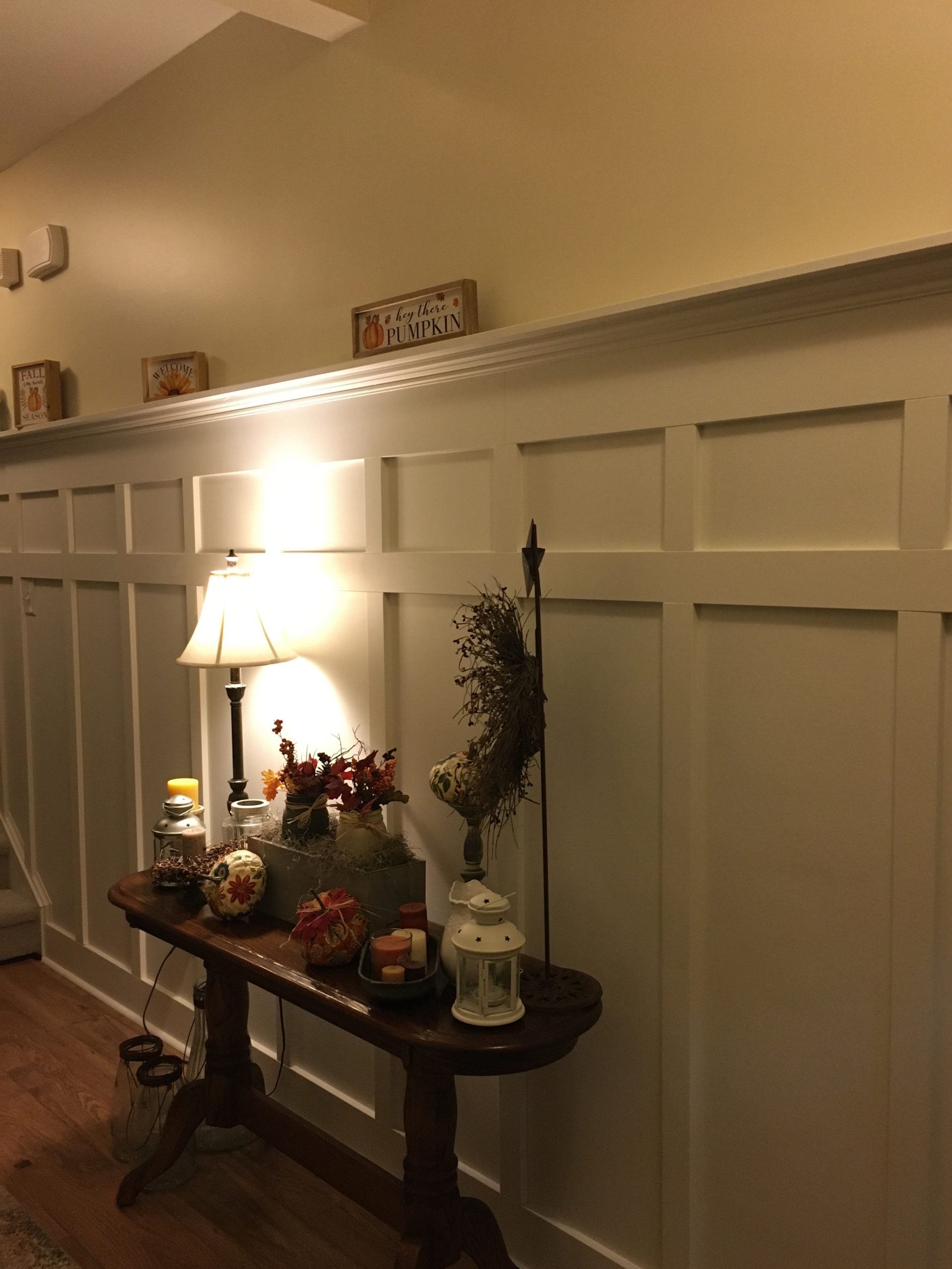
Our front hallway in the last house had a gorgeous (if I do say so myself) wainscoting kind of thing going on. I found it on Pinterest, and Nigel built it. That hallway was nine feet tall. I think the top “shelf” was at about six feet. And, oh, how I loved to decorate it! When we were in the planning stages for this house, we discussed, very briefly, having white woodwork. In our early married life, I wouldn’t have ever wanted white woodwork! But, it is definitely my favorite now. The price, however, stopped us from having it in our new house! I’m debating having Nigel recreate the hallway with stained wood. What do you think? As we were planning the house, the builder asked about the wall color. He would paint additional colors with an upcharge (it was pretty high) so we opted for just one color. I picked Sherwin Williams Antique White, and I have been regretting it ever since! In the photo from our old house, the top color is antique white. The bottom color is Sherwin Williams Alabaster. That’s probably the color I should have gone with in this house! That’s OK…I like to paint!

More front hallway…
One of the things I realized right away when we moved into this house was that I have a lot of pictures…a lot! In our old house, we had a couple of gallery walls. I had taken one down when we did our dining room redo (read about that here). The other was in the family/living room. I haven’t decided if I’m going to do one in this house or not. I also can’t decide where to put it, but the front hallway is a contender!
A classroom memento…
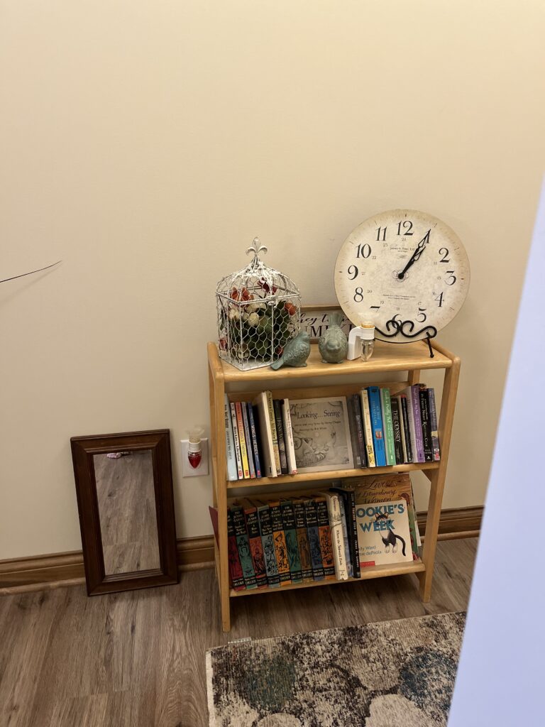
I had this book shelf in my classroom. I always had a fountain on it so the top of it is water damaged. I told Nigel I was going to paint it, but he likes it this way. He says it shows its history. All of the books in it have a special meaning for me. On the top shelf in the middle is Looking…Seeing by Harry Chapin. Nigel is a huge Harry fan. On one of his albums, he talks about this book. For Christmas, one year, I bought it for Nigel on eBay. Unfortunately, it’s autographed to Charlotte! He doesn’t care because it’s Harry’s signature! You’ll also see a set of books on the lower left side. Although these aren’t the exact set I grew up with, I read these over and over again. I don’t remember what happened to the original set. A co-worker of Nigel’s gave them to him one year. I’m missing one or two from the set. Cookie’s Week is a book I used when I was a special education teacher. I actually taught a student to read using this book. I also don’t know where to hang that mirror!
The living room…
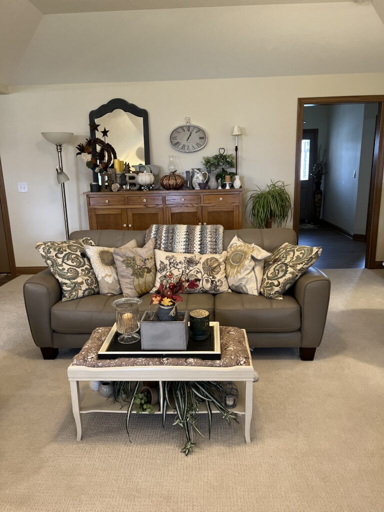
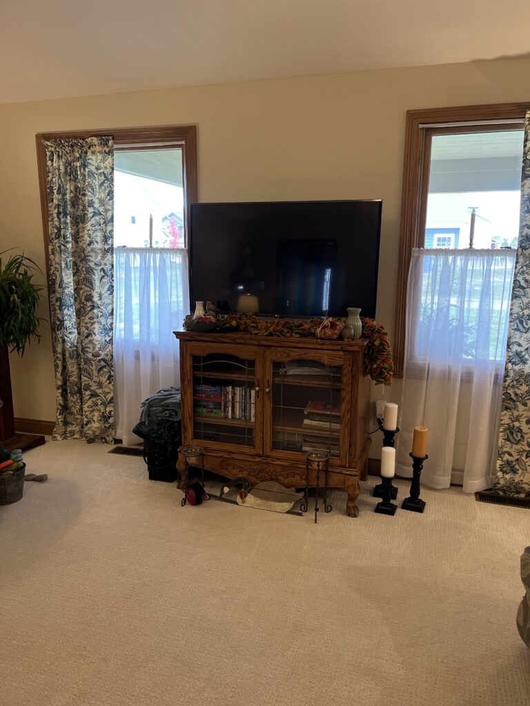
Our last house was open concept. I really, really dislike open concept! I don’t like my kitchen being seen from the living room. Our house is completely custom. The builder has a basic design, and we could move walls, eliminate rooms, make all kinds of changes. One of the things I thought about (Nigel never did) was putting a wall up between the kitchen and living room. That would have created a very small and dark kitchen which was something I really didn’t want! So, you can see the kitchen from the living room…le sigh! The living room is really big. We opted not to build a fireplace. We had fireplaces in the last two houses and rarely used them. The living room windows look out onto the covered patio. I don’t know what kind of ceiling this is. It’s not vaulted, and it’s not cathedral. It goes up at an angle on all four walls. The center, which is almost all of the ceiling, is flat. That probably doesn’t make sense, but I don’t know how to describe it! I even tried to google it!

A little more…
Did you notice the two “wing” chairs? We bought those when we moved seven years ago. After a couple of years, one of them seemed to fall in on itself. Nigel tried to fix it, but he didn’t spend much time on it. He had been wanting a LaZBoy for quite a while. We ordered two and moved the other two chairs up to the master bedroom. After a bit, Nigel decided to look at the chair again, and he fixed it! When we moved to this house, we left behind a leather sectional. We had this grey leather sofa in the basement. It fits quite well in this room, don’t you think? Take a look at the TV stand. Originally, it was an armoire with doors that would close to hide the TV. The TV at that time was one of those monsters that weighed a ton! When we eventually replaced it with a flat panel, the armoire didn’t work. We were just going to get rid of it and buy something new. I suggested we cut off the top and use just the bottom. Nigel cut off the sides thus separating the top from the armoire. We then took the severed top and put it on top of the bottom half (sounds difficult, but it wasn’t). I have good ideas sometimes!
The kitchen…
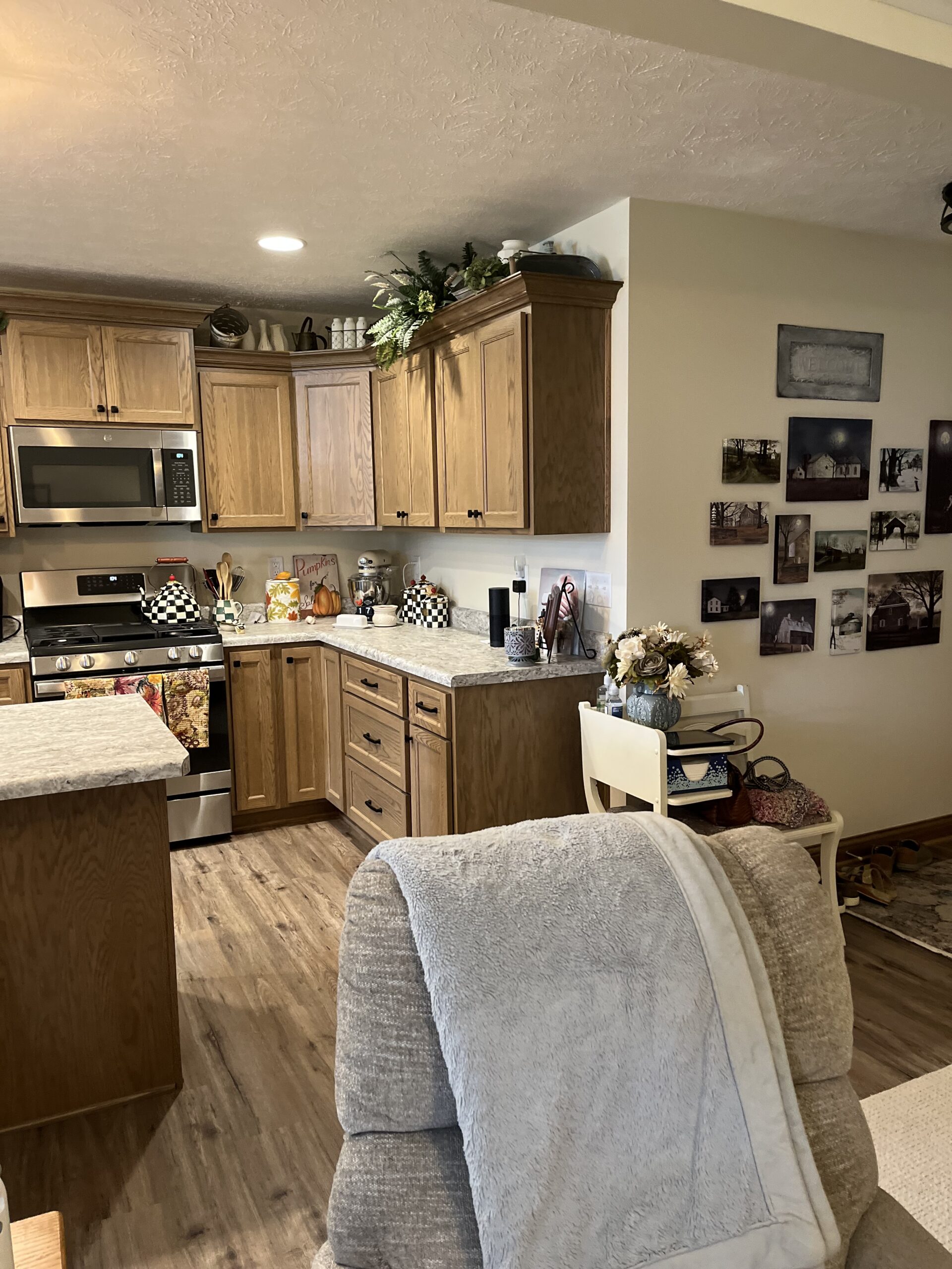
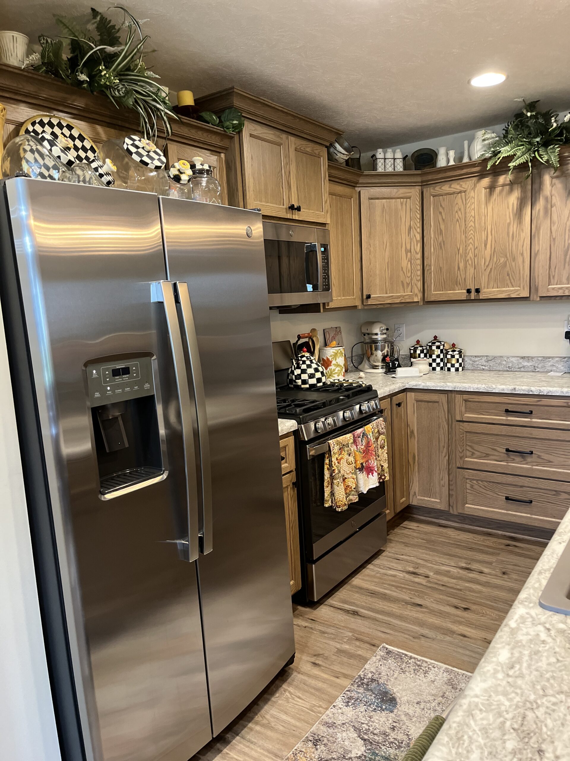
At first, I was really disappointed I wasn’t going to have another white kitchen (many, many zeroes involved in that price). And, we had set a bottom line for the house so I didn’t go with taller upper cabinets. We did have the cabinet above the stove raised a bit (would you believe that cost money) and added crown moulding. Now, I love the result! My only problem with this kitchen is it’s a bit small. I had to work hard to find places for all of my bakeware. Luckily, the pantry is huge so I could put my appliances there. And, Nigel and I often bump bums when we’re working in it! He keeps reminding me smaller is better which is ironic since I’m only 5’1″!!
The dining room…
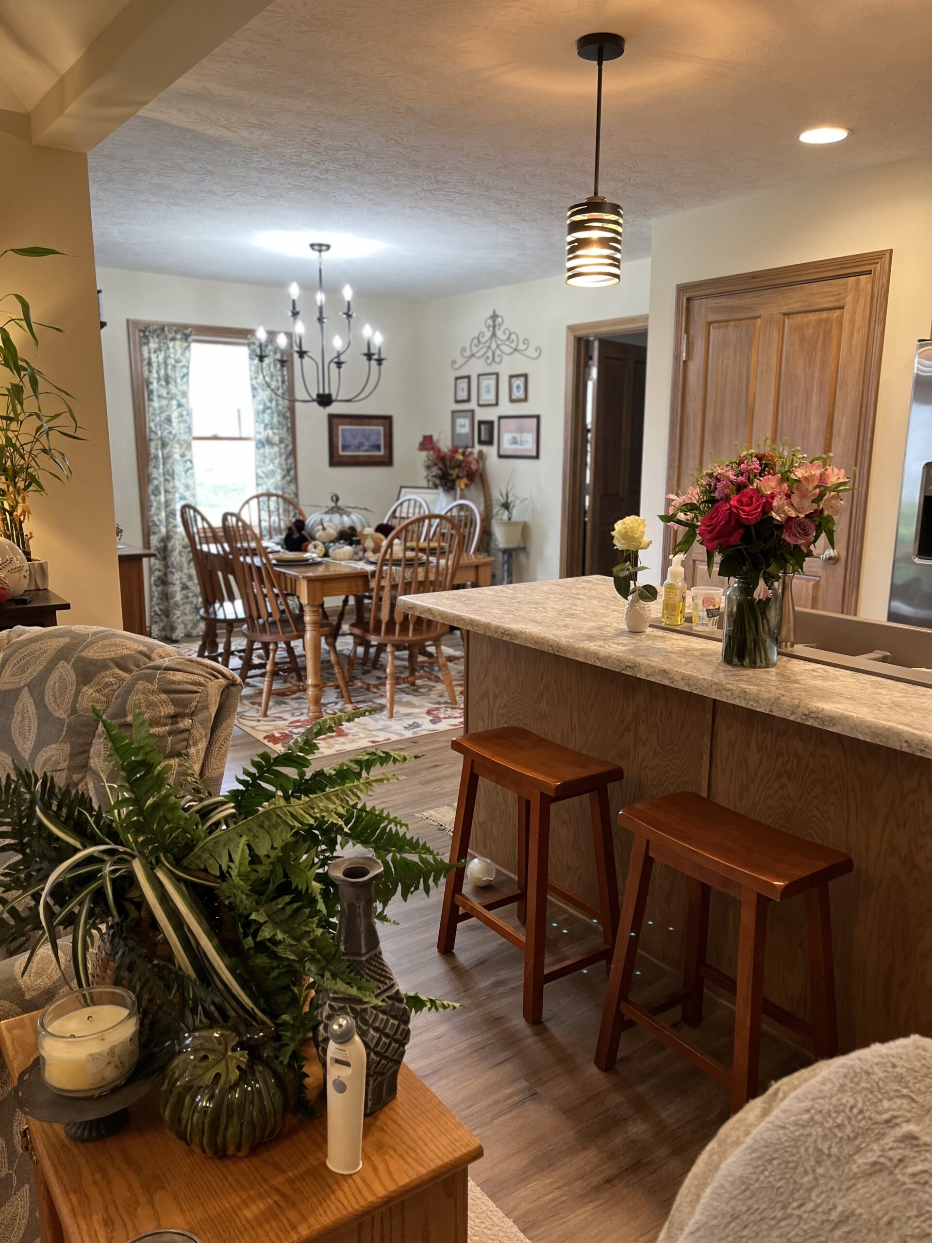
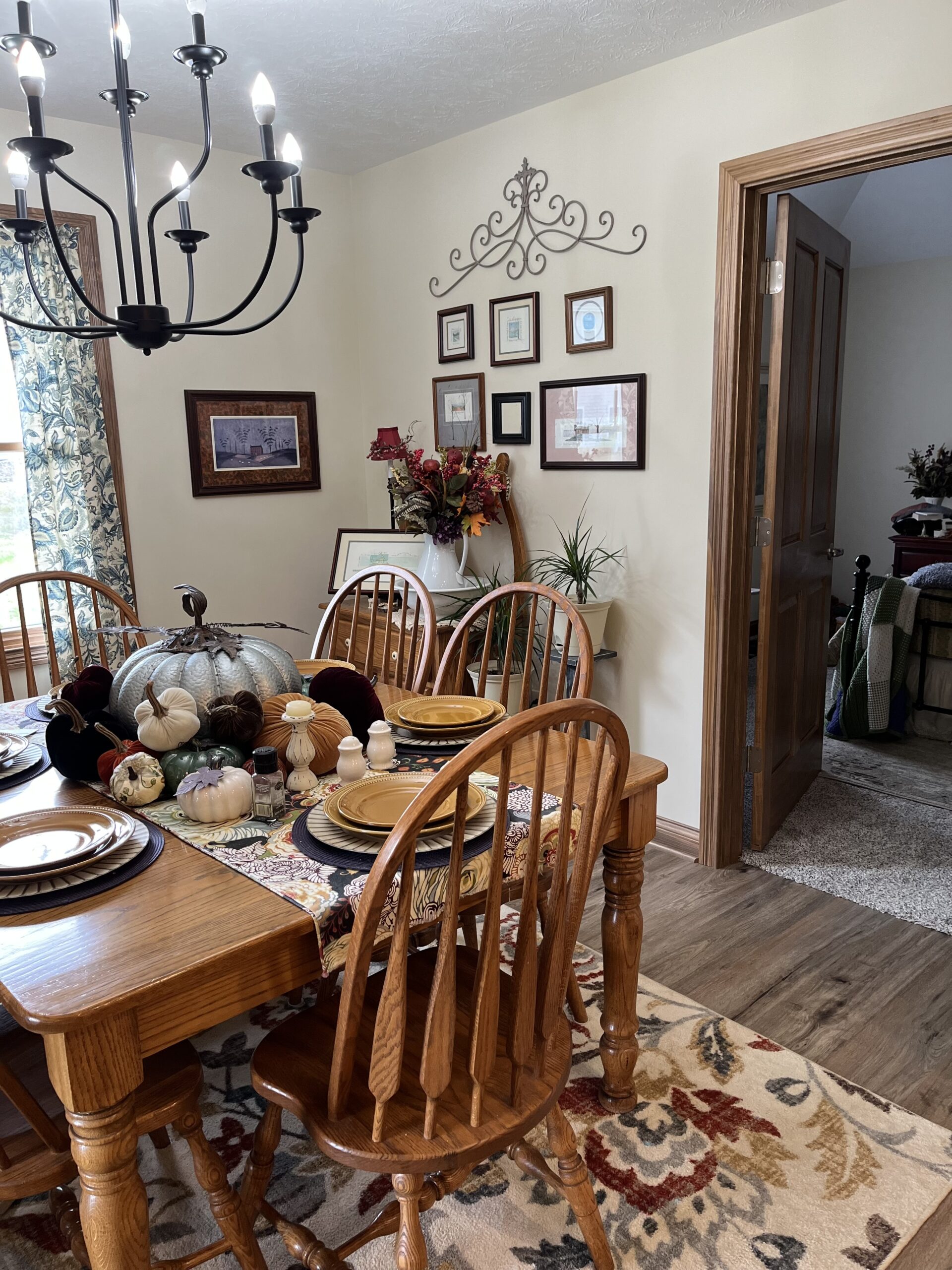
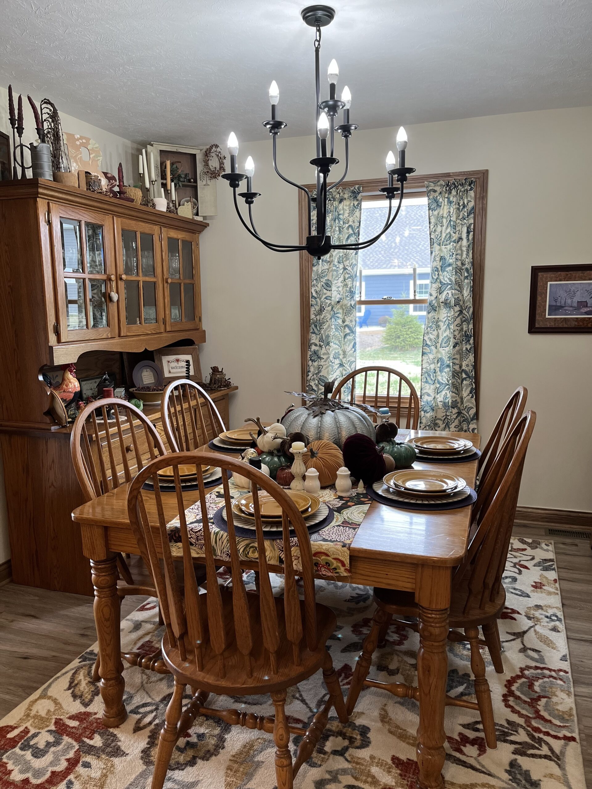
The dining room is where we added some square feet. We decided to extend the back of the house by two feet. I wish we’d pushed out the side at least a foot. One of the things I don’t think I mentioned before is that this condominium community is mainly older people. Older people, apparently, do not have dining rooms. They have dinette spaces instead! Well, this older person wants a dining room. I know the furniture is waaaay too big for the room, but I’m having a hard time bidding farewell to this furniture. We did take the center leaf out of the table. There is no place to put the extra dining room chairs so we have kept them round the table. The upside of these homes being designed for older people are the wider hallways and doors!
Odds and ends…
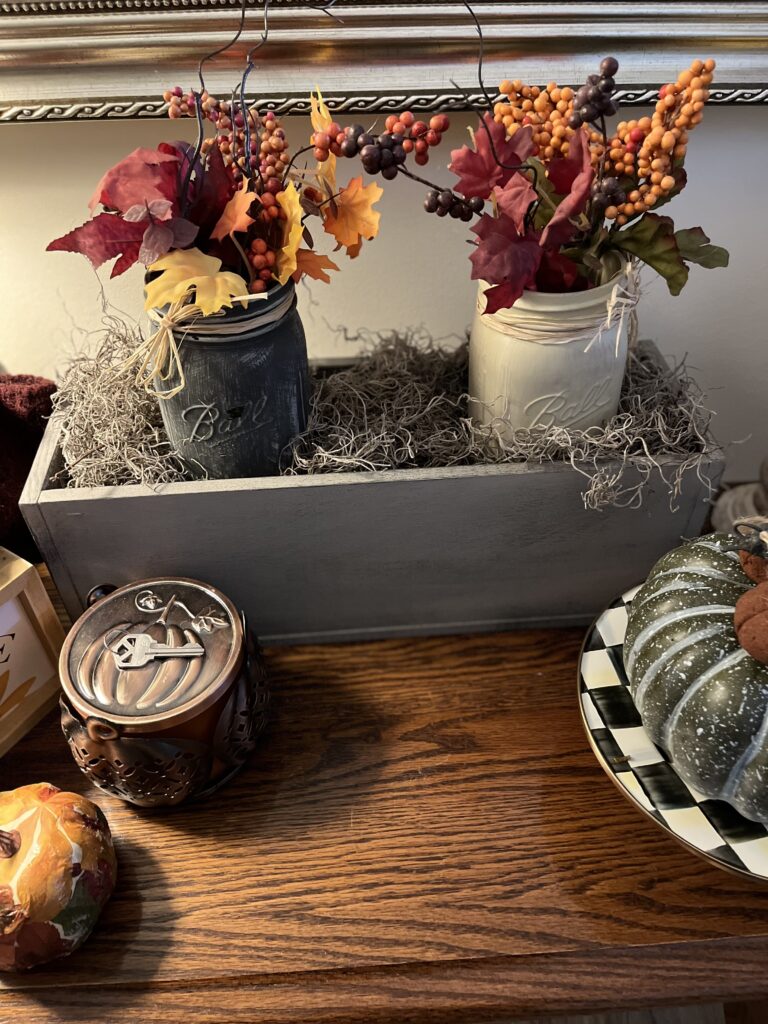
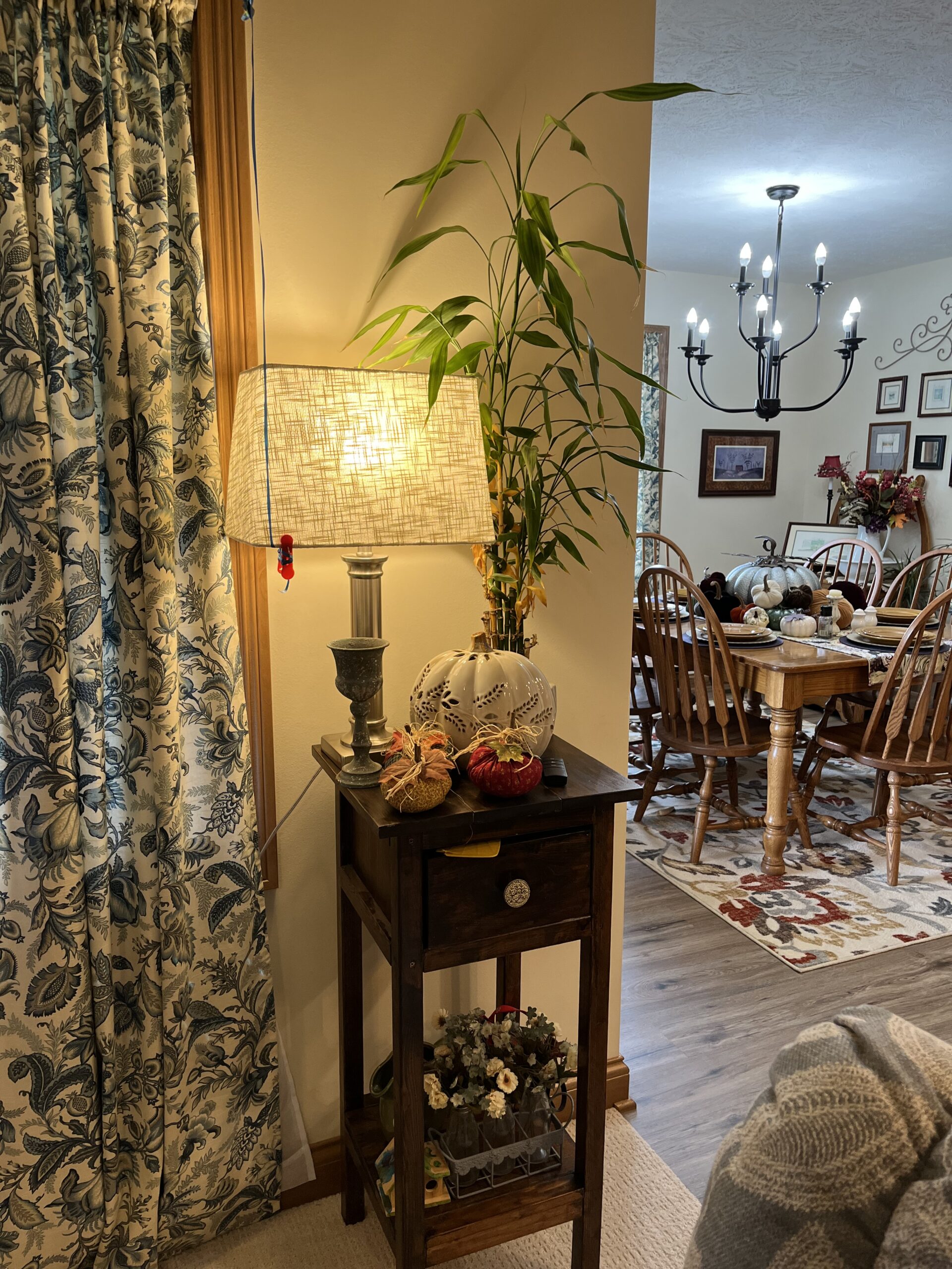
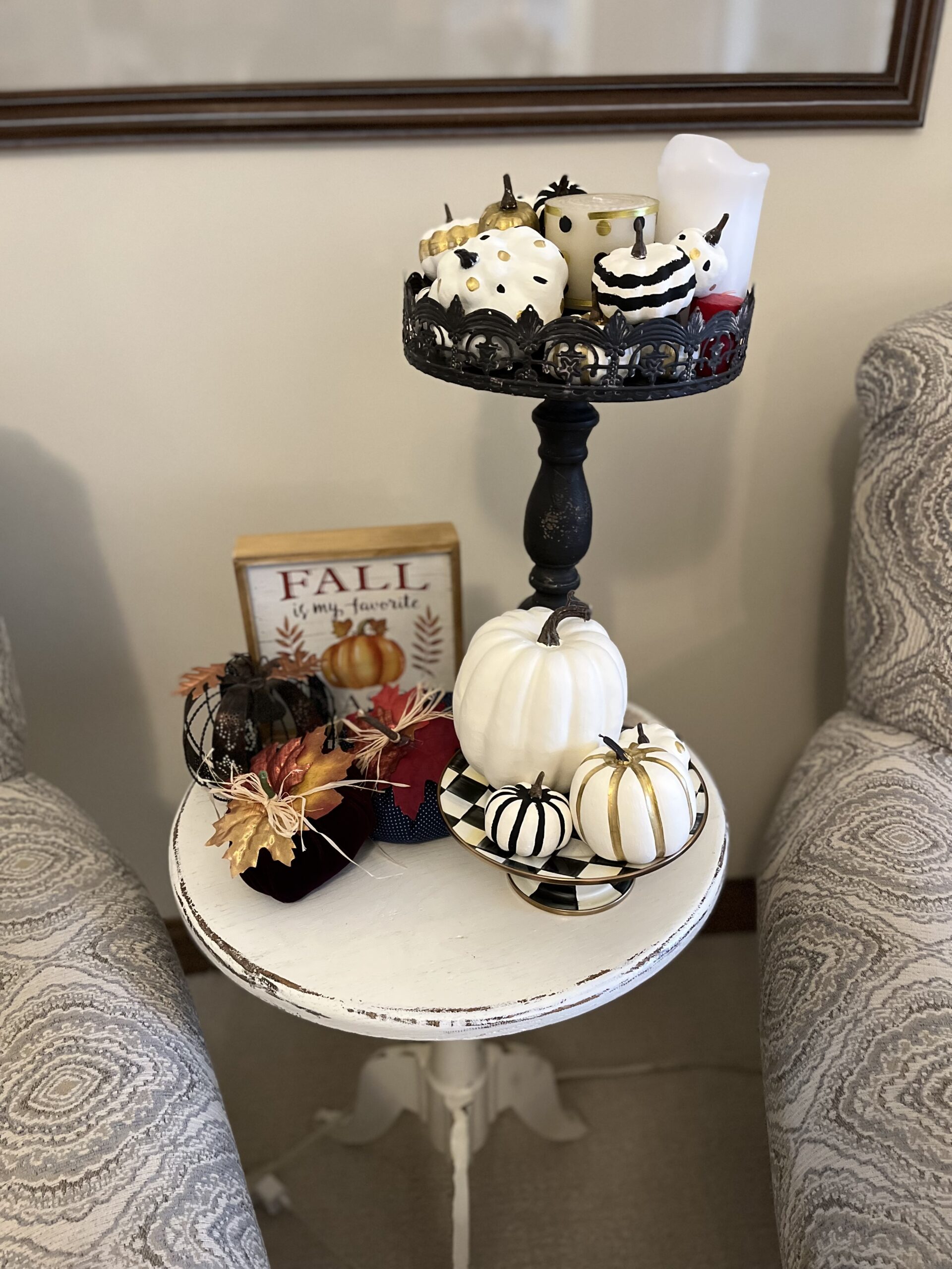
The photo with the closed door is the front bedroom which is the craft room/computer room/guest room/Jack’s room! Nigel wasn’t exactly thrilled with the expense of the solid four panel doors…until they were here and stained. Now, he loves them! My son-in-law made me the table with the bamboo plant on it. There was no way I was getting rid of it. On the side table next to that photo are some fabric pumpkins I made several years ago. The next photo shows a pumpkin I decoupaged with napkins from Party City! The picture in the frame was actually a Christmas card from Nigel’s oldest brother and his wife! The next shows some pumpkins I decided to paint.
Wrap it up, Marsha!
I’m guessing you didn’t expect a minimalist look from me when it comes to my home, right? I know there is a lot of stuff on tables. In our other house, that stuff was in different places. This year, I am just getting a feel for whether or not I want to keep it. You would not believe what I’ve already gotten rid of, though! So, can we talk? Are you a minimalist in your decorating approach? Or, do you enjoy finding little tchotchkes and displaying them? Please leave a comment or two, and we can talk! I promise to answer as soon as I can!

Affiliate links and such:
Just a reminder that Marsha in the Middle may use an affiliate link. Those links are usually italicized. If you click or make a purchase from an italicized link I provide, I may receive a small commission at no cost to you. Thank you for your support. I recently became a Brand Ambassador for Sarah Flint shoes. You can use SARAHFLINT-BAMARSHA for $50 off your first pair. As of right now, I also have an affiliate code for Kantha Bae! Use MarshaintheMiddle in the promo code box for $5 off any order (excluding Bestie restocks)! I have also become a Halftee Partner. Use the code, MARSHA2098, for 20% off any purchase. In case you didn’t know, bloggers must disclose the use of affiliate links. That’s why I include this in each post.
Thank you!
There truly are no words to tell you how much I appreciate each and every one of you! Thank you from the bottom of my heart!
Where you can find me:
Linking up with Nancy’s Fashion Style, My Bijou LIfe, Fine-Whatever, Is This Mutton, Shelbee on the Edge, Chez Mireile, The Grey Brunette, and Away from the Blue. I also link up with This Blonde’s Shopping Bag, Doused in Pink, Being a Wordsmith, and Mummabstylish. Please check out these wonderful ladies and their blogs! I’m a co-host on the Weekend Traffic Jam (here). I also am a co-host for Ageless Style on the third Thursday of the month and Songful Style on the last Monday of the month. I also host Final Friday Print Mixing on the last Friday of the month. I do hope you’ll check out all of these blogs and link parties!

I love a peek in others people houses. It’s always inspiring although my house is very minimalistic and all white. Thanks for showing us your home!
Oh, I love to look at other people’s homes. I’m always looking at realtor.com to see how people decorate and what colors they use! I’m just very nosy, I think!
I enjoyed your home tour. Your living room is beautiful, and your fall décor is cute.
xoxo
Lovely
http://www.mynameislovely.com
Thanks so much, Lovely!
Oh I do love a look around other people’s houses. For years now this whole area in the south of England has Open Houses for art shows. I go purely to look inside people’s houses!
I use to love antique and kind of brown furniture, with lots of ornaments, now I am very minimalist, with white walls and white shelves. Colour comes from my art, so I do have lots of paintings on walls and my yellow chair and blue chair plus cushions and throws. I’ll have to do an interior shot of my place!
Really enjoyed this post!
Thanks, Penny! I really tried to love the white house look in our last house, but I just couldn’t do it. And, I can’t wait to paint the walls in this house. The funny thing is how different the color is from room to room owing to the amount of natural light in it. But, I find it so boring so I hope to change it soon. I’d really like to wallpaper the master bathroom, but Nigel abhors wallpapering! I find it a fun challenge!
Your new home is just lovely! Your living room ceiling sounds just like our bedroom ceiling (which the plans called “vaulted”… even though you are right and it’s not technically vaulted. I fall somewhere in the middle as I’m definitely not a minimalist and yet I don’t want clutter either but I do like cute little homey touches here and there. I used to read Cookie’s Week with my boys; I love that book! It didn’t hurt that the cat looked so much like our own cat at the time.
Thanks, Joanne! Our builder called it a Dutch cathedral ceiling, but when I google that, our ceiling doesn’t look anything like that! Oh, that makes me smile knowing other readers were created with Cookie’s Week!
Marsha your house is so beautiful!! I love it! I love all of your fall decor that is here and there, and the special books. Your dining room table in particular looks so festive!
And not decor, but we have that same thermometer! LOL.
Thanks, Erin! I just love to make my home a retreat, and decorating for the seasons does that for me! Trust me, there were many tears shed as I packed up books to be given away. Many of them went to teachers at the school where my daughter-in-law works. But, it was still so hard…like saying a final goodbye to my teaching career! My son-in-law always makes fun of how much “stuff” is on the dining room table when we have family get togethers. I will definitely have to clear it off when we get together now!
Nigel is a bit of a hypochondriac after the last few years. I need to just put the dang thing away!!!
I love the wood flooring and the wood furniture it’s so cosy and charming. This was a fun post to read.
https://www.bauchlefashion.com/2022/10/5-things-you-should-know-before.html?m=1
Thanks, Heather! It’s actually a luxury vinyl plank flooring. But, the wood furniture is all very, very old! I keep thinking about painting it, but something (Nigel actually) keeps me from doing it!
Thank you for sharing a tour of your house Marsha. It’s always hard to figure out where to put what at first sometimes. Heck, I moved things around 3 and 4 times when we moved into our house in AZ.
I on the other hand, love the open concept. And I’m shocked you didn’t get a fireplace. Especially with the snow you get there. You’d laugh at us, but we actually miss a fireplace. Yes, even here in AZ.
XOXO
Jodie
http://www.jtouchofstyle.com
You’re very welcome, Jodie! I’ve already rearranged the living room and am contemplating a change again! Mike doesn’t really get it. He doesn’t have to move the stuff because I have those Magic Movers that make moving heavy items a breeze!
I just don’t like the idea of being able to see into my kitchen! I don’t mind the open concept if the kitchen were it’s own room so you wouldn’t have to worry about dirty dishes! And, yeah, we’ve had fireplaces in three of the five homes we’ve had. All three were completely different from each other and were beautiful. But, except for the second one, they didn’t really warm up the house. And, even the second one didn’t heat the whole house so there would be spots where it was downright cold. Then, factor in losing an entire wall to a fireplace…and do you decorate with that being the focal point of the room? It was also money saving because, of course, it was an upcharge! Although, last night when we got a dusting of snow, I did mention it would be nice to have a fire!!!
Lovely new home! Congratulations!
Thanks so much, Maggie! I’m beginning to feel at home here!
What a fun tour of your house! I’ve always been a renter, so it’s interesting to hear about the choices you make with a new house. I am another person who has a lot of little decorative things all over the place (though mine are very different in style), but I admit that it drives me crazy how much they collect dust. I am also not into fireplaces; they just feel like more trouble than they’re worth. I don’t do seasonal decoration other than a Christmas tree every couple of years, so I enjoyed seeing your pumpkins etc. You could say that my place looks like Easter year-round 😉
Thanks, Sally! Look for another edition the next time I need to blog and have no ready photos! Dust, what’s that? Hahaha!! When you get older, the eyes don’t see dust as easily! Theoretically, I like fireplaces. Realistically, they take up too much real estate in the room, eat up an entire wall, and don’t always provide that much heat. So, while I like the idea of one, I’m definitely ok without one! Oh, I’ll bet you have lots of wonderful bunnies around the house! Maybe, a home tour is in order???
What a magnificent job you have done in such a short time to make this beautiful house and warm, cozy home. I am not a minimalist either…no wonder we get along so well!! But I am beginning to look at things sitting about and wondering if I might be able to do away with this and that. I have a lot of seasonal decorations, although I have far fewer than I had 2 years ago. So progress has been made.
We are contemplating taking up our carpet in the bedrooms, hall and stairs and replacing it with laminate. Not sure what floor treatment you have but I certainly like it. Our walls are a caramel color that was popular when we built the house in 2008. But it is most out of fashion now. Sure as we paint the walls with something cooler in a gray tone, then the warm color will be all the go again.
Love the book shelf. Perfect spot for it. And Harry Chapin. Be still my heart. I saw him in concert at the University of Tennessee shortly before he died. The concert was extraordinary.
Thank you for the tour. I like tiny houses and thought for a moment you have purchased a tiny house RV that we would be touring,,,very clever SEO. I need to take more time with things like that if I ever get back to blogging with gusto.
Thanks, Leslie! I have such a sentimental streak…I could probably tell you where most of my little things have come from or when I made them! Christmas decorations may need to be pared down as I have four trees…but I’m trying to figure out where to put them. One of the things we didn’t do was to put in enough electrical outlets!
We have luxury vinyl plank flooring which all the rage around here. I still loved the laminate we put down in the old house. It came from Lowes and still looked brand new when we moved! I paint my house the colors I like and don’t really worry about trends. Our bedroom in the other house was a grey, but we had white woodwork. I’m not sure how that would work with the stained woodwork now. I’m going to have to ruminate on that one! I say go with what makes you happy!
I am so jealous you actually saw Harry! What an underrated singer and human being he was! We have his Gold Medallion (or something like that) boxed set. He was such an amazing person…we need more Harrys in this world.
Oh, my closet is probably the size of some tiny homes. I always wonder just how long people actually stay in them after buying/building them. I couldn’t do it even on my own. But, I do love to watch the shows about them!
I was never a minimalist but Michael was, and he hated having ‘stuff’ anywhere so we used to have everything very bare. Fortunately, he’s changed as we’ve gotten older and now he probably likes to display stuff more than I do lol!! We’ve got so much stuff in our rented house at the moment, purely because we’ve run out of places to keep it all lol. My office / wardrobe is full of bits and bobs, as well as TV and a sofa, AND my photography studio!! One of these days, I must do a blog post and video about it.
Personally, I think your home is beautiful, and it seems like the perfect extension of you. I love the idea of a photo wall, why not use the wall where you have your little book case? I think it would look fabulous!
Big hugs
Suzy xx
Thanks, Suzy! That wall is one of the places I’m considering. I’m also thinking about using two of the walls in the front bedroom. Decisions, decisions!!! I have a friend who lived in an apartment for an entire year after their home sold quickly. So, their stuff was in storage that whole time…an apartment, not a house! I can’t imagine doing that! I hope everything gets sorted for your new build quickly so you can spread out! Strangely enough, some of the boxes that aren’t unpacked are Mike’s stuff! I’m not unpacking it because I’m not sure where he wants to put it!
Your new place is beautiful and inviting, Marsha! You really have a talent for decorating. I’m sure it’s difficult to downsize. (We had the opposite issue when we moved – we upsized to accommodate my mom.) Personally, I like an open floor plan, so I think your layout is lovely. As for me, I didn’t inherit my grandmother’s knack for decorating, so I am quite minimalist. Plus, I hate dusting knick-knacks. And because Dan and I have so many hobbies between us, the house is never perfect. There is always something lying around that one of us is working on. Your place looks like a model home. Awesome!
Michelle
https://mybijoulifeonline.com
Thanks, Michelle! The downsizing has been the worst! Making decisions about what to keep and what to send on to someone else is tough…especially when you’ve got memories associated with them! But, now that things are in place for the most part, it is beginning to feel like home. I don’t dust my knick knacks because they really aren’t out that long…about a month or so. Then, it’s on to the next season! Well, I did move stuff out of the way of the camera…hahaha!!!
Your home is gorgeous and stunning, sweetie! You have a remarkable flair for interior design. I like the wooden dining set.
Latest article:
https://www.melodyjacob.com/2022/10/halloween-gift-ideas.html
Oh, thank you so much! No one has ever said that to me! We bought that dining set decades ago, and I just can’t let it go!
What fun to take a peek into your new home! It looks like you have settled in nicely and it looks fabulous! Nice and cozy and cute!
Thanks, Laura! It’s slowly beginning to feel like home!
I love your little house tour! The flooring in your house is beautiful and dying over that lovely kitchen. I like that you kept the bookshelf from school the same. I have a similar one that has followed me everywhere!
https://www.kathrineeldridge.com
Thank you so much, Kathrine! I really do like my little kitchen. When it was first installed, I almost cried because they didn’t offset the microwave cabinet. After they corrected that and added the crown moulding, I was thrilled with it! We did skip granite countertops because of price but also because I really like drop in sinks.
I really wanted to keep something from my teaching days, and this bookshelf worked perfectly in that space. Luckily, the hallway is wide enough that it doesn’t create any kind of problem. I’d love to see yours!
Marsha, your home is so beautiful and exactly as I imagined it would look! I see lots of April Cornell (or April Cornell inspired) prints all about and they made me smile! I like the zig and the zag of the front hallway. It has much more character than a boring straight hallway! We have tons of random stuff covering all the surfaces in our house and I am trying to make it more minimalist and more purposeful as I redecorate each room. Your decor has given me some ideas to consider!
Shelbee
Thank you so much, Shelbee! I have always been a bit of a decorator at heart…I have Nigel trained to think in terms of odd numbers whenever he’s helping me do something! He doesn’t really get it, but he knows that’s the rule! I am flattered you have found some ideas from me! As in my clothing, I like a little of this and little of that when it comes to home decor!
Your home is beautiful — warm, cozy, and inviting. Thanks for letting your readers take a peek.
Carol
http://www.scribblingboomer.com
Thank you so much, Carol! I am working on it. Now, if I could just convince a certain someone that the bathroom needs just a bit of wallpaper!
I love looking at people’s houses! You were right about “tiny house” – it pulled me in right away because those dinky houses fascinate me! I’m with you on not liking open plan. We’re going to have a big house makeover at some point and I’m definitely going for white walls and neutrals. Thanks for linking.
Thanks, Gail! I am so intrigued by those houses and often wonder just how long people stay in them before moving into a larger place. I couldn’t do it. I love white walls…in other people’s homes! I just can’t do it!
What a wonderful home tour Marsha. I love the design that you and your husband picked. I have to mention that large pumpkin in the middle of your table. I love it! Your home looks so cozy and festive for the fall season.
Thanks so much, Meagan! I picked that pumpkin up at Hobby Lobby years ago for 80% off!!! I was thrilled. It was one of the first things I looked for as we opened the fall decor boxes!
I just read Penny’s post about her flat so this was perfect follow up reading! I do think I am a minimalist as far as decorating and I have gotten more particular about what I am keeping. I do love to have pictures on the walls from trips and special family times so we do have lots of photographs. I enjoyed the tour and reading why you chose to do for the different spaces of your new house.
http://www.chezmireillefashiontravelmom.com
Thanks, Mireille! I am definitely not a minimalist though I probably was when I had kids. They would have been knocking into things! And, they created lots of dust! Now, most of the things I put out are things I’ve made. I made a lot of the pumpkins or changed them in some way. I have so many photographs…I finally made my kids take their huge senior pictures home and told them they’d better not even think about throwing them away! Those photographs cost a fortune!