

Style Imitating Art…
Welcome to Style Imitating Art which comes from Salazar, Shelbee, and me. You can think of this series as fashion meets art museum! SIA challenges people to find inspiration in different art works, create looks based upon that art work, and share them with the curator for that piece. Shelbee is this week’s curator with this gorgeous piece of art.. I hope you enjoy this post, the information, and my interpretation.
How it works…
Every other Monday one of us selects an inspiration piece of art and posts the image on their blog. We then invite others to interpret that art work through their style. The following Monday, we share our outfits. The curator shares submissions the following Wednesday on her blog. Shelbee chose this week’s art work for this round of Style Imitating Art. If you’d like, you can read why Shelbee chose it here. Please send your photo to Shelbee by Tuesday, September 24th by 10 pm EST. Style Imitating Art is an interesting way to inspire your outfits. You can see a few of my looks here, here, here, and here.
About the artist…
Pieter Cornelis Mondriaan was born in Amersfoort, a province of Utrecht in the Netherlands. Born on March 7, 1872, he was the second of five children born to Pieter Cornelius Mondriaan and Johanna Christina de Kok. At some point in time, the Mondriaan family moved to Winterswijk where his father was head teacher at a local primary school. His father was a qualified drawing teacher, and his Uncle Frits was a pupil of Willem Maris of the the Hague School of arttists. The young Mondriaan would often paint and draw along the river, Gein. In 1892, he studied at the Academy for Fine Art in Amsterdam. He had already qualified as a teacher and began teaching primary education as he practiced his own painting.
A little more…
During this time, Mondriaan’s work was mainly landscapes, showing windmills, fields, and rivers. His paintings were more naturalistic or Impressionistic. He would go on to try many different styles and techniques as he searched for his own personal style. Some of the styles he tried included representational (representing something rather than an actual painting of the item), pointillism, and Fauvism. He held his first exhibition in 1893. You can find some of this work in the Kunstmuseum Den Haag. The painting, “Avond,” is the first known Mondriaan painting with an emphasis on primary colors. From 1905 to 1908, many of his paintings begin to show his emerging abstract style. They are scenes of “indistinct trees and houses reflected in still water. Although the result leads the viewer to begin focusing on the forms over the content, these paintings are still firmly rooted in nature, and it is only the knowledge of Mondrian’s later achievements that leads one to search in these works for the roots of his future abstraction (source).”
Still more…
Mondriaan moved to Paris in 1911 and dropped the second “a” in his last name as an attempt to separate himself from the Netherlands and become more a part of the avant-garde contingent in Paris. Piet Mondrian, as he was now known, became very interested in the theosophical movement by Helena Petrovna Blavatsky. This movement, sometimes referred to as a religion, seems a little convoluted to me. I can make neither heads nor tails of it so I’ve included a link (here) for you to read more about if if you’d like. From what I can gather, the aim of this movement was to reach enlightenment through spiritual knowledge held by certain “Masters.” Mondrian used this to further hone his style. I honestly don’t get how the two went together, though.
Even more…
Eventually, Mondrian narrowed his style down to what he called neoplasticism. He worked with lines, and primary colors (usually only red, yellow, and blue). His paintings consisted, primarily, of lines which formed squares though some works would also have triangles. Mondrian would mix those colors himself (though they’re primary colors) instead of just using the paint right out of the tubes. Often, the colored squares he would paint in various directions while the black lines were painted in a flat manner. In a letter to H. P. Bremmer, Mondrian tried to explain his style:
“I construct lines and color combinations on a flat surface, in order to express general beauty with the utmost awareness. Nature (or, that which I see) inspires me, puts me, as with any painter, in an emotional state so that an urge comes about to make something, but I want to come as close as possible to the truth and abstract everything from that, until I reach the foundation (still just an external foundation!) of things… I believe it is possible that, through horizontal and vertical lines constructed with awareness, but not with calculation, led by high intuition, and brought to harmony and rhythm, these basic forms of beauty, supplemented if necessary by other direct lines or curves, can become a work of art, as strong as it is true (source).”
Even more…
Throughout the 30s and 40s, Mondrian would continue to experiment with lines, some thinner, some thicker, some even doubled. His work continued to evolve as he played with the placement of lines, colors, and shapes. As the Nazi invasion of France and Paris threatened, Mondrian moved to London and finally to Manhattan in the US. He would remain there until his death. Mondrian brought several unfinished canvases with him and worked for hours at a time, often until blisters formed. He would work until he cried or made himself sick. It was as if he knew he had limited time to finish these pieces. He began to experiment with painted paper tape. He would create lines and squares from this, often working on white walls. He would move them from place to place, seeking that enlightenment from the theosophical sphere. He created “New York City I,” an unfinished work, which consisted of strips of painted paper lines, In October 2022, someone figured out it had been hung upside down. It had hung in the Museum of Modern Art in New York City, but it is now at the Kunstsammlung Nordrhein-Westfalen where it continues to hang upside down. The gallery has done this in order to not harm it.

A skosh more…
Mondrian didn’t just paint on canvas. His studios were works of art in themselves. He painted his studio in Manhattan the same off-white he used ordinarily; discarded orange and apple crates became seats, tables, and storage cases and were painted the same color. A white metal stool received a coat of the primary red he painted the cardboard sheath he made for his records. Eight large compositions of colored bits of paper were tacked and re-tacked to the walls, creating different looks for those visiting Mondrian in the year or so he had that studio.

Finally…
Mondrian’s death on February 4, 1944 from pneumonia would have seemed to put an end to this creative genius. His friend and sponsor, Harry Holtzman and another friend, Fritz Glarner, filmed the studio as well as photographing it. This collection was open to the public for a six-week exhibition. Before dismantling the studio, Holtzman (who was also Mondrian’s heir):
“traced the wall compositions precisely, prepared exact portable facsimiles of the space each had occupied, and affixed to each the original surviving cut-out components. These portable Mondrian compositions have become known as ‘The Wall Works’. Since Mondrian’s death, they have been exhibited twice at Manhattan’s Museum of Modern Art (1983 and 1995–96), once in SoHo at the Carpenter + Hochman Gallery (1984), once each at the Galerie Tokoro in Tokyo, Japan (1993), the XXII Biennial of Sao Paolo (1994), the University of Michigan (1995), and – the first time shown in Europe – at the Akademie der Künste (Academy of The Arts), in Berlin (22 February – 22 April 2007). His work was also shown in a retrospective exhibition at the Whitechapel Gallery in London, which ran from August – September 1955 (source).”
Several paintings were part of the Nazi seizures during World War II. The Mondrian heirs and estate have since sued for the return of them. In October 2020, they filed a lawsuit in the US against the Kaiser Wilhelm Museum in Krefeld, Germany, to have four paintings returned to them. I can’t find anything saying these paintings have been restored to the Mondrian beneficiaries. In December 2021, the Philadelphia Museum of Art was sued for the return of “Composition with Blue.” It had also been seized by the Nazis, passed through art dealers and was eventually gifted to the museum by Albert E. Gallatin. The Philadelphia Museum of Art disputes the claim, saying Mondrian’s heirs, including Holtzman, knew the painting was being displayed there.
A little extra…
Well, now that you’ve read all of this, here is a short (IMHO too short) video about Mondrian.
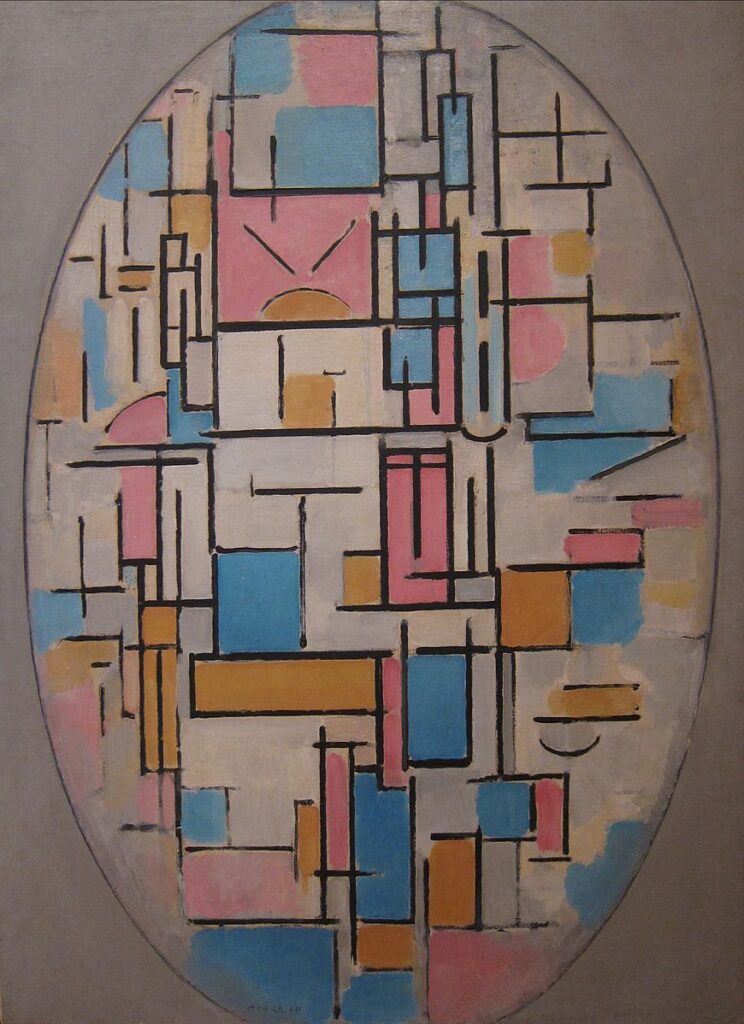
About the art work…
The art work was originally purchased from Mondrian by S. B. Slijper (Blaricum, the Netherlands). The Sidney Janis Gallery in New York acquired it sometime between 1949 and 1950. It is now owned by the Museum of Modern Art in New York City and was purchased with funds from the Stephen C. Clark Fund in 1950. It is oil on canvas and measures 42 3/8 x 31″ (107.6 x 78.8 cm). I don’t believe it is currently on display.
My interpretation…
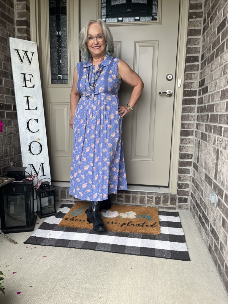
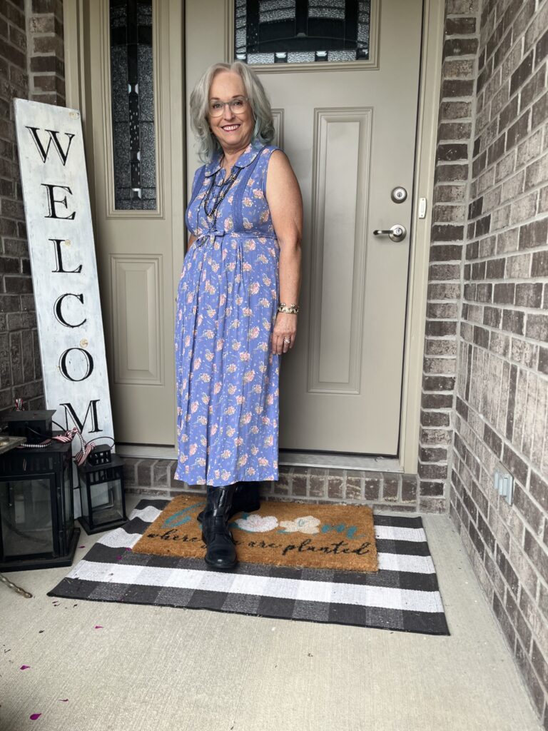
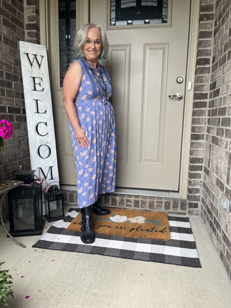
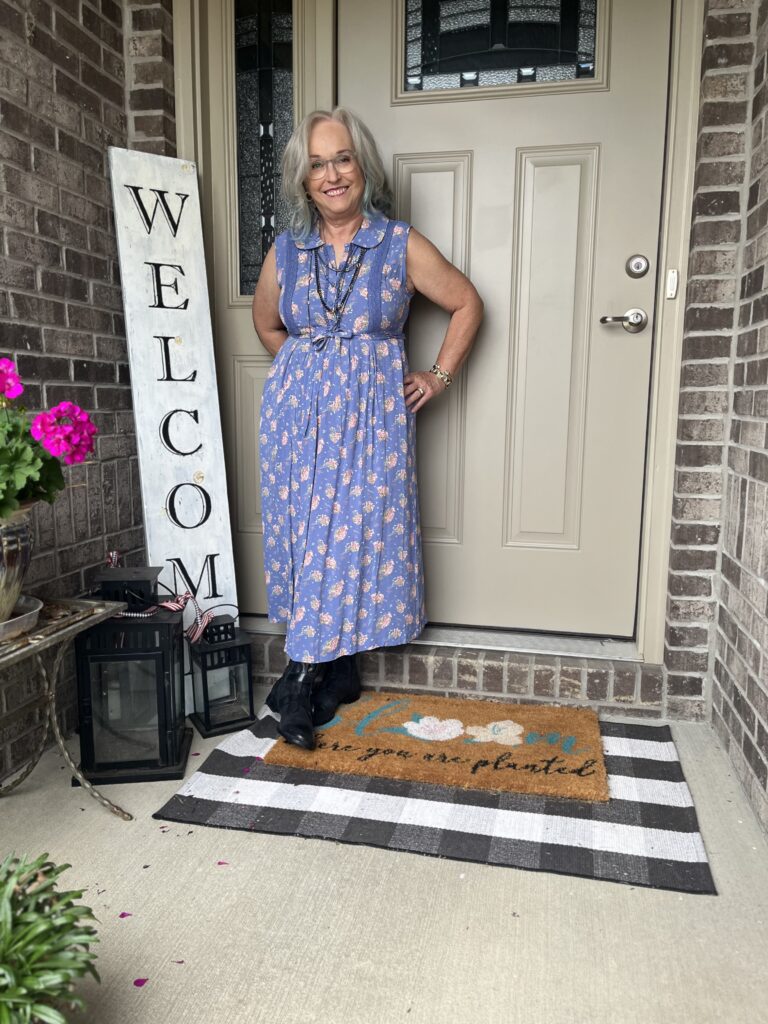
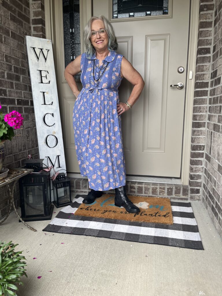
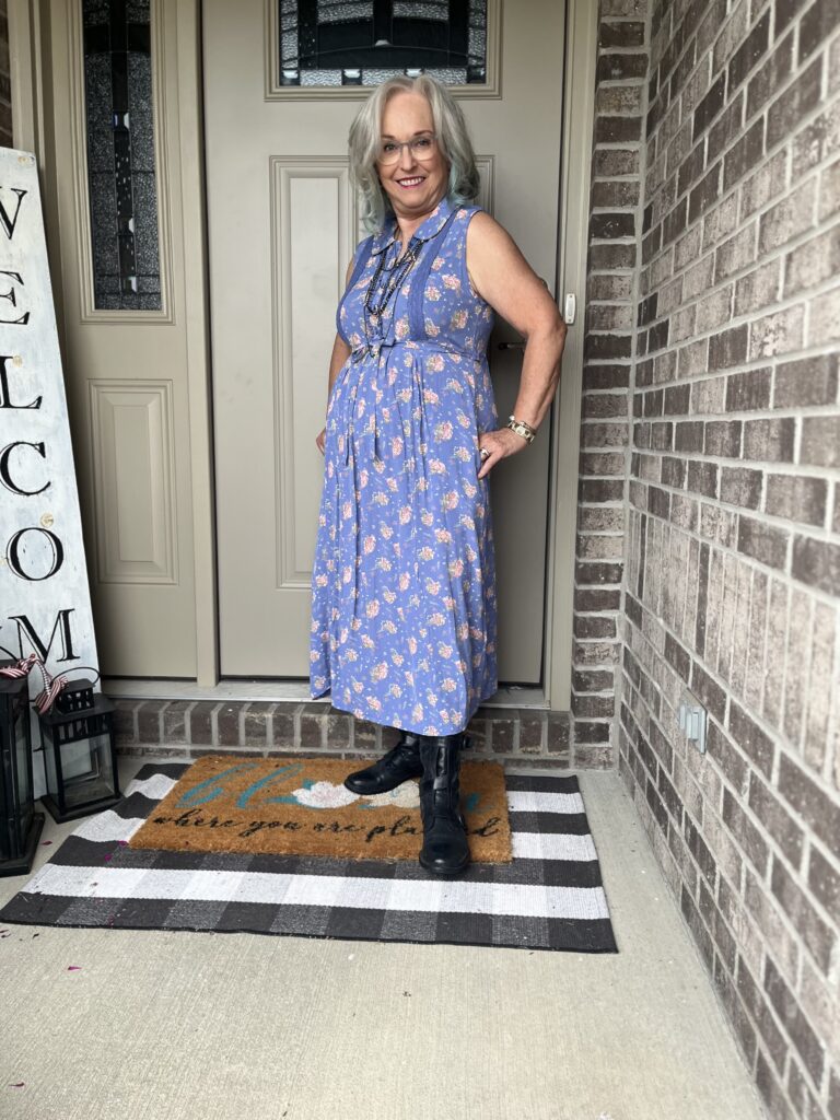
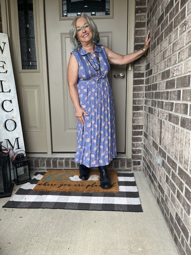
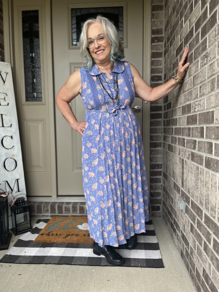
It seems I almost always use an April Cornell dress or skirt as the basis of my interpretation of a piece of art. Today is no different. I went into my closet looking, mainly, for black lines. But, I couldn’t find anything. Then, I decided to go with the colors of the art. The blue isn’t quite right, but I think it works. I have to remind myself I’m imitating or interpreting the art. I also found yellows and pinks in this dress. So, none of these colors are primary colors…but, again it’s an interpretation!
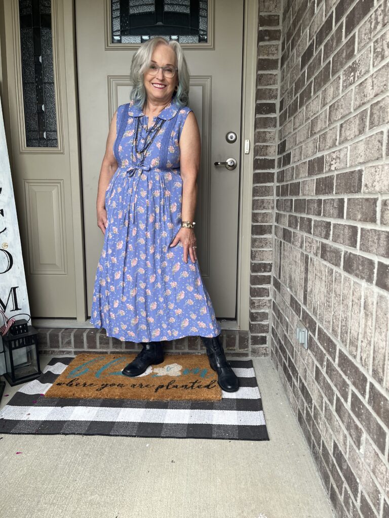
The Lewk!
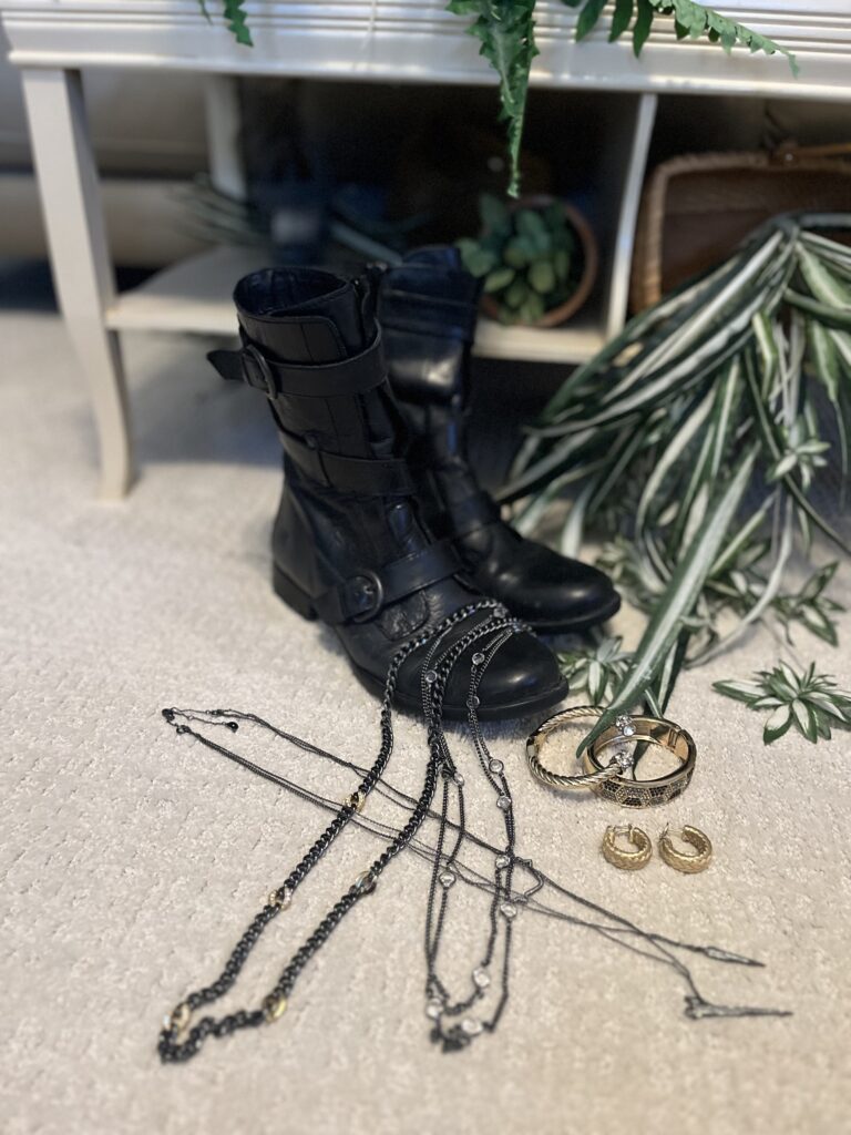
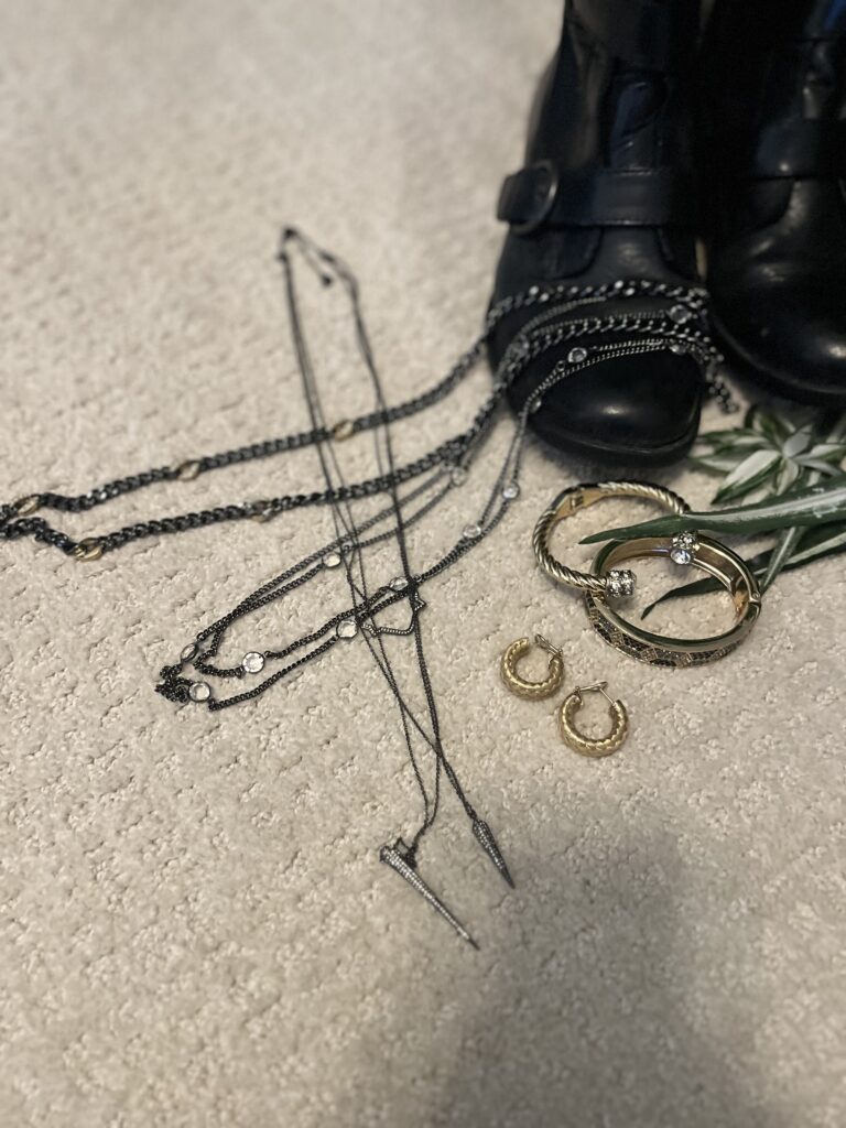
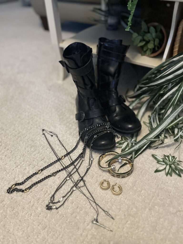
Nigel was really confused when I put on these well-loved Born boots. I answered him by showing him the inspiration art work, and he still didn’t get it. I told him they represent the black lines in the art, and then the light bulb went off! I also added in black and gold jewelry. The three necklaces are all from Stella & Dot. The two bracelets are from Banana Republic, and the gold earrings were Christmas gifts from Nigel several years ago.
Wrap it up, Marsha!
Even though I don’t understand the relationship between Mondrian’s art and his beliefs, I find it so interesting that he created art in this way. I also didn’t know he painted in other manners. Just google him, and you will discover so many different approaches to art. I have to admit my first exposure to Mondrian was on the walls of the school where I taught. We had an amazing art teacher who would do studies of various artists for each grade. Then, she would have the kids create a piece of art in that style. She would then use the hallways as art galleries! So, can we talk? Did you know Hermès and Yves St. Laurent created clothing and accessories based on the iconic Mondrian “look?” Have you seen Mondrian sticky notes? How about a phone case? What do you think of his color palette? Please leave me a comment or two, and we can talk. I promise to respond as quickly as I can.
Don’t forget…
If you want to be included in the Style Imitating Art round up, send Shelbee your photo by 10:00 pm EST Tuesday, September 24th. Photos of everyone participating will appear on her blog on Wednesday, September 25th! While I didn’t understand Mondrian’s philosophy, I do love his art. There are so many ways to approach the challenge…the colors, the lines, the dynamic colors and lines. You could have lots of fun creating a look! Come on, give it a try! I think you’ll love it!

Thank you!
I want to thank all of you from the bottom of my heart for reading, commenting, subscribing or emailing! It truly means so much to me! If you’d like to follow me on Instagram, you can find me here.
Affiliate links, discount codes and such:
Just a reminder that Marsha in the Middle may use an affiliate link. Those links are usually italicized. If you click or make a purchase from an italicized link I provide, I may receive a small commission at no cost to you. Thank you for your support. I am an April Cornell Brand Ambassador for another season. You can use my code, MARSHA15, for $15 off any order over $100. Use Marsha12 for 12% off any order of $65 or more at Buykud. I have also become a Halftee Partner. Use the code, MARSHA2098, for 20% off any purchase. I am also an affiliate with Clara Sunwoo. You can use my code, MARSHA10, for 10% off your entire order. In case you didn’t know, bloggers must disclose the use of affiliate links. That’s why I include this in each post.
Where you can find me:
Linking up with Nancy’s Fashion Style, Fine-Whatever, Is This Mutton, Shelbee on the Edge, Chez Mireile, Suzy Turner, and Away from the Blue as well as Deb’s World and A Fresh Cup of Coffee. I also link up with This Blonde’s Shopping Bag, Doused in Pink, I do deClaire, Mummabstylish, Style Splash and Elegantly Dressed and Stylish as well as the Senior Salon Pit Stop (Esme’s Salon) and Slices of Life. Please check out these wonderful ladies and their blogs! I also am a co-host for Ageless Style on the third Thursday of the month and Songful Style on the last Monday of the month. I co-host Traffic Jam Weekend every Thursday with Melynda, Lisa, and Sue. I also host Final Fridays on the last Friday of the month as well as 10 on the 10th on the 10th of the month! I do hope you’ll check out all of these blogs and link parties!
I love your interpretation and I loved reading about the artist and his history. You always put so much into these and they are fascinating. The bit about the museum in Philly being sued was crazy!!
Thanks, Lisa! I am always so curious about artists and what led them down a path to create what they do. I know…I couldn’t find anything to see if the case had been resolved or not. I think the museum’s reasoning was a bit flawed, though. Just because the descendants of the trust knew the work was there doesn’t mean they didn’t want it back. But, I don’t have a legal mind, either.
Great post! I love how you connect fashion and art. Your interpretation of Mondrian’s work is inspiring. I can’t wait to see everyone’s outfits.
Thank you so much, Doris! I was quite pleased with the end result though it took me a bit to get there.
I immediately thought the black of your boots and their straps were a good tribute to the black lines. Your dress is very pretty.
Thanks, Joanne! I think that’s because of your art background! I was hoping they would work.
This is such a creative project and you do it so well. I look forward to seeing what you come up with every week.
Thank you, Aletha! I have to admit this one was a bit tough, but it really does push me to find something that will work well with the art.
Ha! I’m no artist, but the blue suits you. Thanks for all the info on the artist and his work.
Thanks so much, Rosie! That’s one of the things I enjoy most about SIA is finding out about new artists or new information about others.
It goes to show how much I am influenced by color because your dress and the SIA are in perfect color harmony.
XOOX
Jodie
Thanks, Jodie! I really thought the dress went very well with this challenge! Perfect color harmony sounds like the name of a song!
I really love this piece of art! The colors and the way they are arranged is so cool. Love this dress!
https://www.kathrineeldridge.com
I think it’s a rather unusual piece for Mondrian. I really do like the softer colors.
Thanks, Kathrine!
Pingback:SIA Gallery of Style | Composition in Oval with Color Planes 1 by Piet Mondrian – Shelbee on the Edge
Hi, Marsha – The more and more you added information about Mondrian, the more and more interesting it got! I’m glad you didn’t just keep it short. My Dad was an artist with a teaching job. He worked in all mediums, painted every day and our entire family each has a house full of his paintings since he passed away. Your dress captures the color palette of the featured art work very well, IMO. I like how your blue hair color is blending in with your natural color; it has a very soft effect. And last but not least, I adore your boot collection. So cool! Thanks for this very informative article – Angie, http://www.yourtrueselfblog.com
Oh, thank you so much, Angie! That is one of the highest compliments ever! I’m just so curious and always want to be learning. I just can’t seem to write a plain old fashion blog! I’m always so envious of artists. They truly make the world a better place, and I’m sure your dad did just that. Thank you for the compliments on my hair. The color is slowly fading away just in time for the next time my hairstylist comes up with a color to use (well, she already has). I do love my boots. I have very large calves so I’ve had to settle for booties. I’m lucky they’ve been in style for so long!
I figured the lines on the bust of the dress from the pleating also emulate the painting! I love that shade of blue! Interesting story behind the painting!
Thanks, Laura! I hadn’t really thought about that…I was so wrapped up in them being black! I’m always so interested to read why artists began to paint the way they did.
So interesting that we both ended up with blue floral dresses for this one, Marsha!
Ah, it’s that old great minds think alike, Sally! I need to pop over to your blog…I’m not getting notifications of new posts anymore from you.
Thanks, Sally!
The inspiration is so cool and amazing. Love the outfit. <3 /Madison
https://fashiontalesblog.com
Thanks so much, Madison! I had to work hard for this one.
Hi Marsha,
What a pretty dress on you, love the color. Love the design inspo and how it is replicated with color and print.
Have a great day!
jess xx
http://www.elegantlydressedandstylish.com
Thank you so much, Jess! I loved how it turned out though it took me a bit to come up with this outfit.
Pingback:Style Imitating Art: “The Muses” by Maurice Denis - Marsha in the Middle