
Style Imitating Art…
Welcome to Style Imitating Art which comes from Salazar, Shelbee, and me. You can think of this series as fashion meets art museum! SIA challenges people to find inspiration in different art works, create looks based upon that art work, and share them with the curator for that piece. I was this week’s curator with this Madonna and colorful cherubim! I hope you enjoy this post, the information, and my interpretation.
How it works…
Every other Monday one of us selects an inspiration piece of art and posts the image on their blog. We then invite others to interpret that art work through their style. The following Monday, we share our outfits. The curator shares submissions the following Wednesday on her blog. I chose this week’s art work for this round of Style Imitating Art. If you’d like, you can read why I chose it here. Please send your photo to me by Tuesday, August 26th, 2025 by 10 pm EST. Style Imitating Art is an interesting way to inspire your outfits. You can see a few of my looks here, here, here, and here.
The artist…
Giovanni Bellini is probably the best known of the Bellini family of Venetian painters. He was born circa 1430 in Venice, Republic of Venice (now Veneto, Italy) and died on November 29, 1516. Marin Sanudo, a Venetian historian, recorded the date in one of his famous diaries. Bellini is interred in the Basilica di San Giovanni e Paolo, a traditional burial place of the doges. The Bellini cocktail is named in his honor, but I’m not exactly sure why. It may be because of the colors in the cocktail and Bellini’s use of color.
A little more…
Giovanni Bellini was long considered the son of Jacopo Bellini, but that thought is refuted by art historian, Daniel Wallace Maze. He believes Jacopo was Giovanni’s much older half-brother and that Gentile Bellini was his nephew and not his brother. However, every site I checked listed Jacopo as his brother and Gentile as his brother. At this point in history, it’s probably a moot point. What is important is that the Bellini dynasty was one of the most important of the 15th century.
Tempera…
In his first years, Giovanni (as opposed to his father and brother, Jacopo and Gentile, respectively) painted with tempera. The use of egg tempera can be traced back to the first century AD. It basically consisted of pigments mixed with some kind of water-soluble binding medium. Many times, this was egg yolk. Eggs would be pierced and hung over some kind of receptacle. After the white had drained out, the remaining egg yolk would then be diluted with water, vinegar, or even wine. This is then mixed with ground or powdered pigment. The exact amounts of pigment and binder varied according to the kind of pigment. The advantages of egg tempera are that it is permanent and fast drying. This was also a problem as it was fast drying!
An important family…
The Bellini family was one of the most influential on the Venetian art scene. Another important family in Venice at the time was the Vivarini family. From what I read, Giovanni was never formally educated but learned from his father as well as his brother-in-law, Andrea Mantegna. His early works were styled after the late Gothic style of his father as well as the Paduan School. This was a Renaissance-era painting school in Padua, Italy. Founded by Francesco Squarcione, the school had a “severe, intellectually rigorous, and classically inspired approach to art (source).” Giovanni’s early works reflected the more rigid lines of the Paduan School as well as being less colorful. From what I could figure out, Giovanni just couldn’t contain himself and imbued his paintings with more depth of emotions than other artists of the time. He began to experiment with form and draping in his paintings.
Early success…
After the deaths of his father and brother, Giovanni was the artist in Venice. He had more commissions than he had time. He often took on commissions he couldn’t complete on time. His first commission was to work with his brother and other artists to paint in the Scuola di San Marco. One of the paintings he produced during this time was Deluge with Noah’s Ark. In 1475, Giovanni met Antonello de Messina. It appears it was during this time Giovanni discovered oil paints. He produced several paintings, probably masterpieces. Unfortunately, these were destroyed a fire in 1577. The last twenty years of the 15th century saw Giovanni working as a conservator of the paintings in the great hall of the Doge’s Palace. His duties included repairing and renewing the works of his predecessors. During his time as a conservator, he received a fixed annual pension. “He was also commissioned to paint a number of new subjects, six or seven in all, in further illustration of the part played by Venice in the wars of Frederick Barbarossa and the pope. These works, executed with much interruption and delay, were the object of universal admiration while they lasted, but not a trace of them survived the fire of 1577… (source.)” Another fire, in 1867, further destroyed his famous altarpiece, painted in tempera for a chapel in the church of S. Giovanni e Paolo. Other works destroyed in that fire were Titian’s Peter Martyr and Tintoretto’s Crucifixion.
Oil paint…
When Giovanni discovered oil paint, the world gained an artist who became an expert at using colors, combining them in different ways as well as the level of saturation. This led to a gradation of tones not seen before. He was able to replace the severity of his early Paduan influences with a softer, more graceful and serene style. His various paintings of the Madonna/Virgin and Child are “tranquil and commanding in their sweetness; the personages of the attendant saints gain in power, presence and individuality; enchanting groups of singing and viol-playing angels symbolise and complete the harmony of the scene. The full splendour of Venetian colour invests alike the figures, their architectural framework, the landscape and the sky (source).”
High Renaissance…
Giovanni was the penultimate artist of the High Renaissance. Now, I’m going to admit I don’t entirely understand this term. What I gather is that it is the time, during the Renaissance, when experts believe art had reached the pinnacle of expression. It was a time of artistic excellence as well as an emphasis on balanced composition, perspective, chiaroscuro, and idealized figures rather than the more realistic ones of the early Renaissance. Of course, other artists were included in the High Renaissance: Leonardo da Vinci, Michelangelo, and Raphael. Most consider Giovanni’s greatest contribution to the Italian Renaissance was his experimentation with color and atmosphere.
Giovanni’s legacy…
Giovanni’s use of soft colors and understanding of the way light worked in paintings led to works like San Zaccaria. He also began painting landscapes suffused with the soft lighting and fabulous colors. Giovanni headed a workshop. Titian, one of his pupils, would eventually challenge him as sole master of the paintings in the Hall of the Great Council. Strangely enough, Titian’s application was granted, taken back after a year, granted again in another year. In 1514, Giovanni began The Feast of the Gods for the duke, Alfsonso I of Ferrara. I think one of the saddest things about Giovanni Bellini is the proportion of surviving works vs what he actually produced. So many were destroyed in fires over the years. Luckily, many do survive.
The artwork…
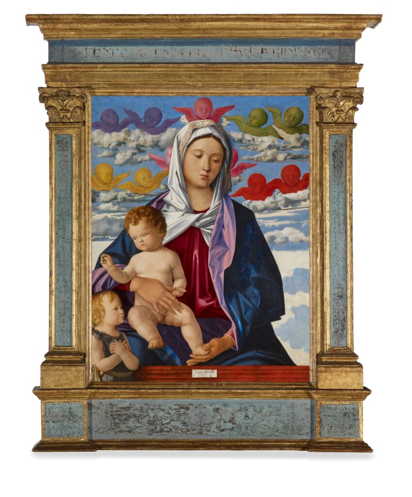
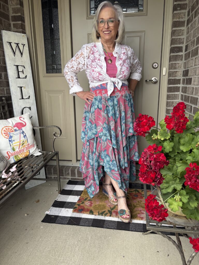
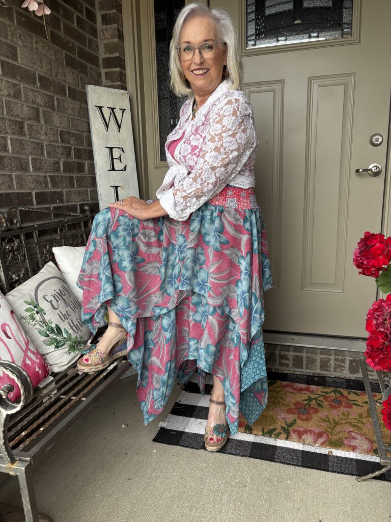
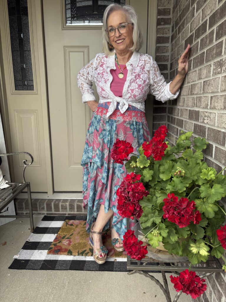
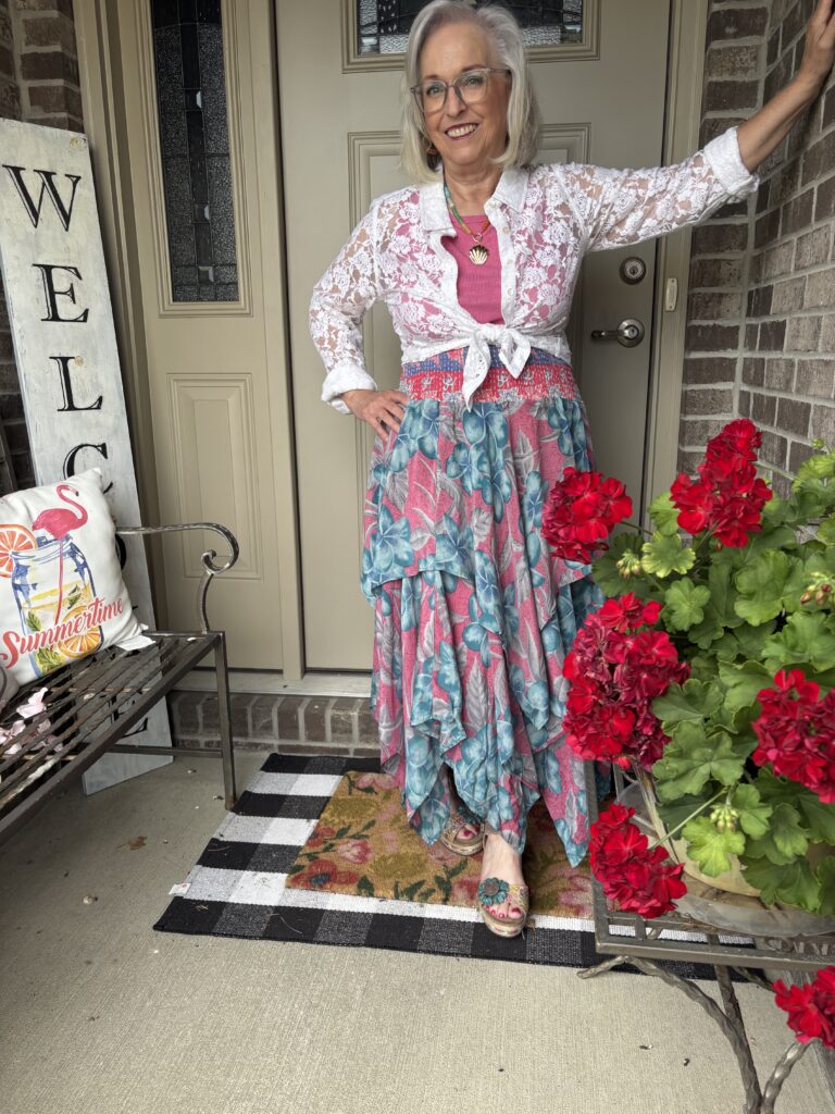
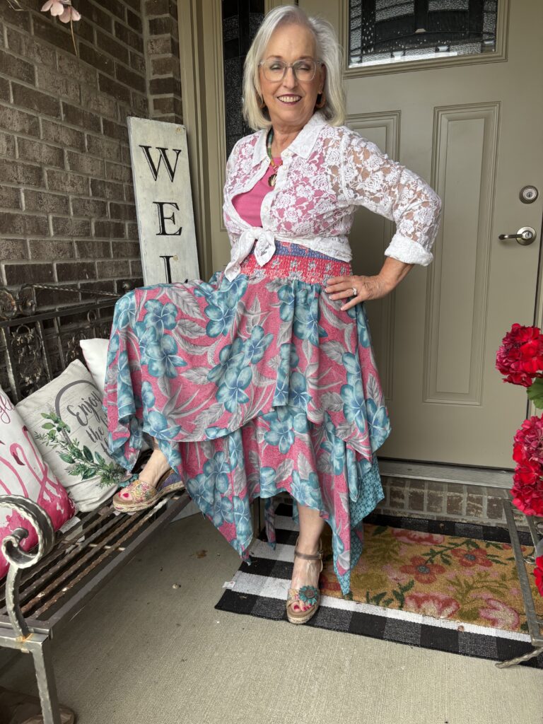
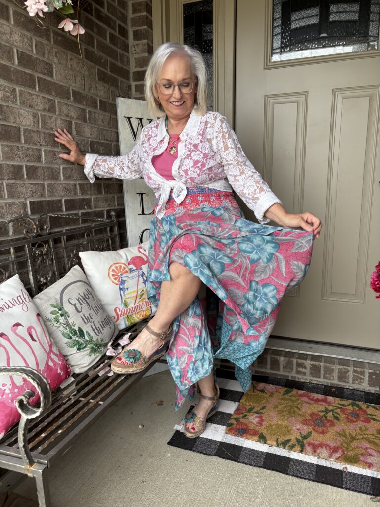
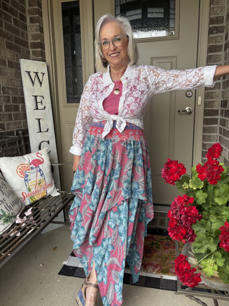
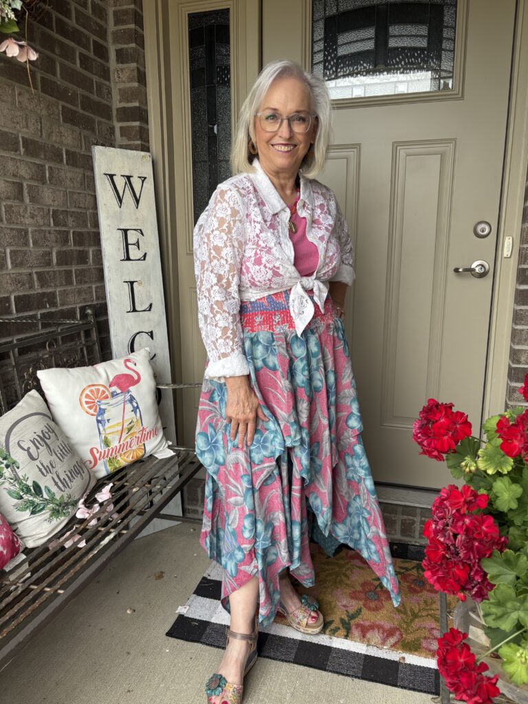
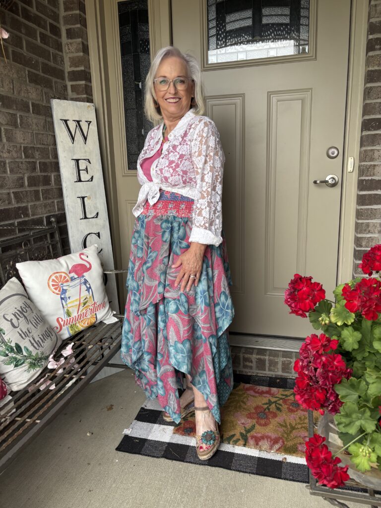
The painting is egg tempura on a poplar panel. It measures 30 x 23 in. (76 x 58.4 cm) and is approximately 45-1/4 x 34-1/2 x 4-1/2 in. (114.9 x 87.6 x 11.4 cm) framed. It’s important to note the artist is listed as Bellini, but the tombstone (the plaque with all the information) also lists the workshop of Giovanni Bellini. This was not unusual at the time, and I’m guessing it’s still de rigueur for artists today. Bellini would have had a workshop with younger artists who worked with him. So, they may have painted inconsequential bits of this art, or they may have painted most of it with Bellini adding little touches here and there. There is also the possibility Bellini never touched it with his paintbrush! The thing that stands out the most about this painting are those pastel cherubim! I mean, really, what was going on in that workshop? I did try to find out if there was any meaning behind them. There is another Bellini painting with red cherubim. One explanation for them is they are balancing out the painting as Mary’s dress is a deep red. That argument could be used here for the red and purple cherubim, but what about the others? I’m flummoxed! This painting is owned by the Indianapolis Museum of Art and was a gift of the Clowes family. It hangs in the Clowes Pavilion.
My interpretation…
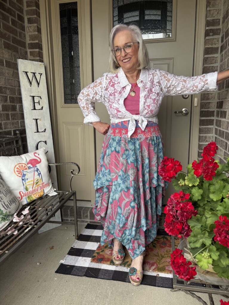
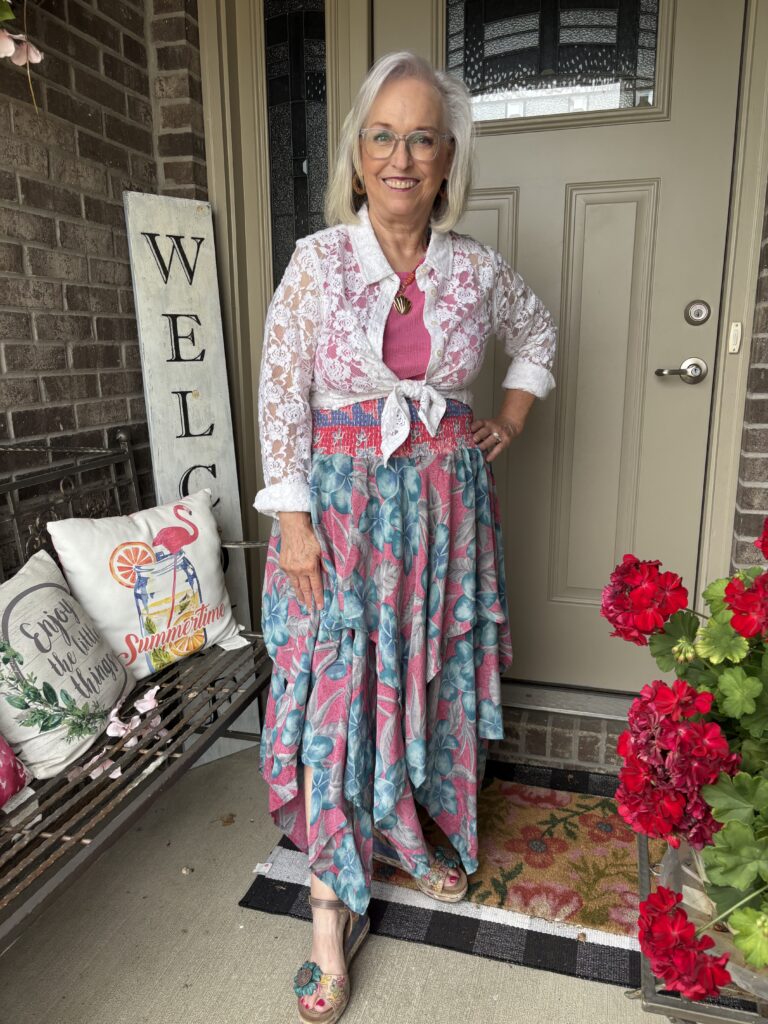
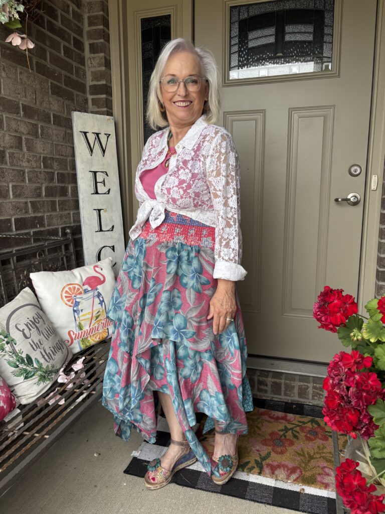
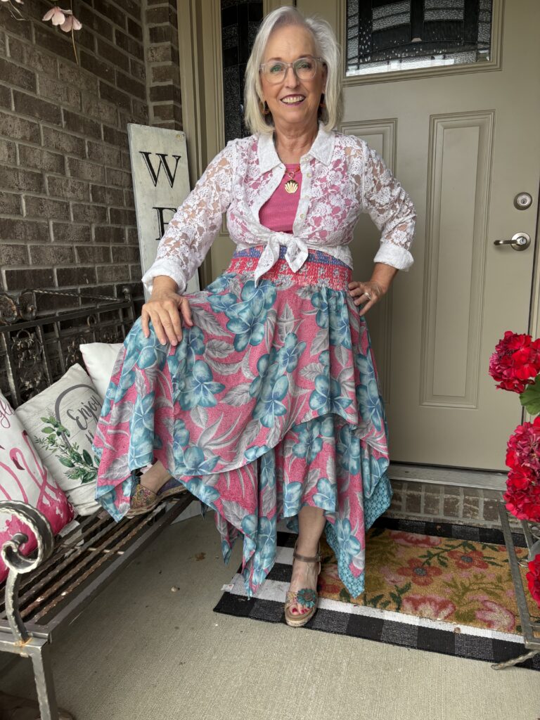
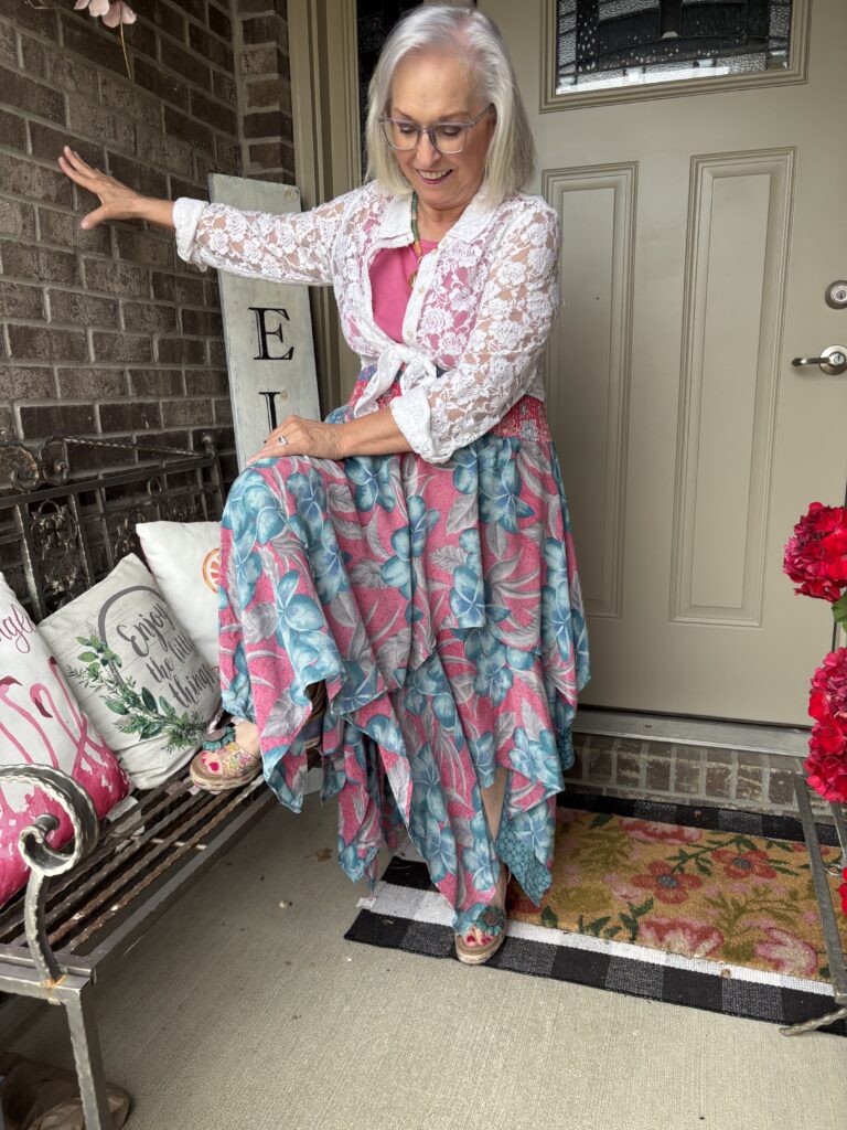
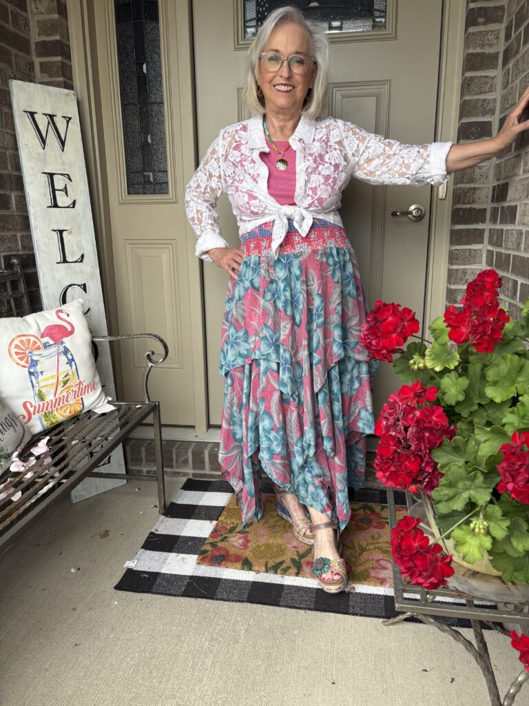
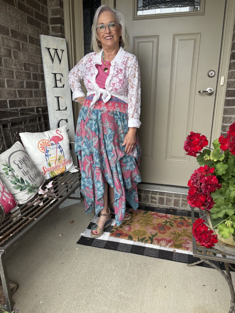
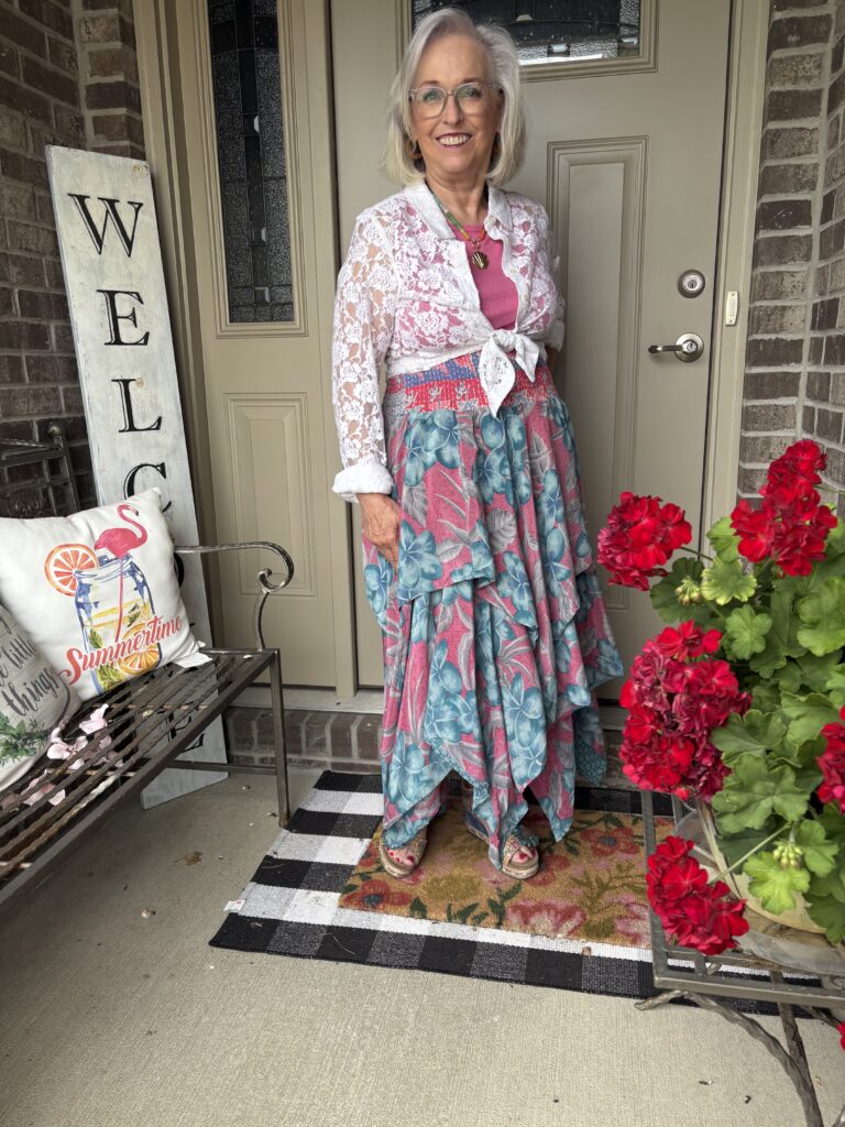
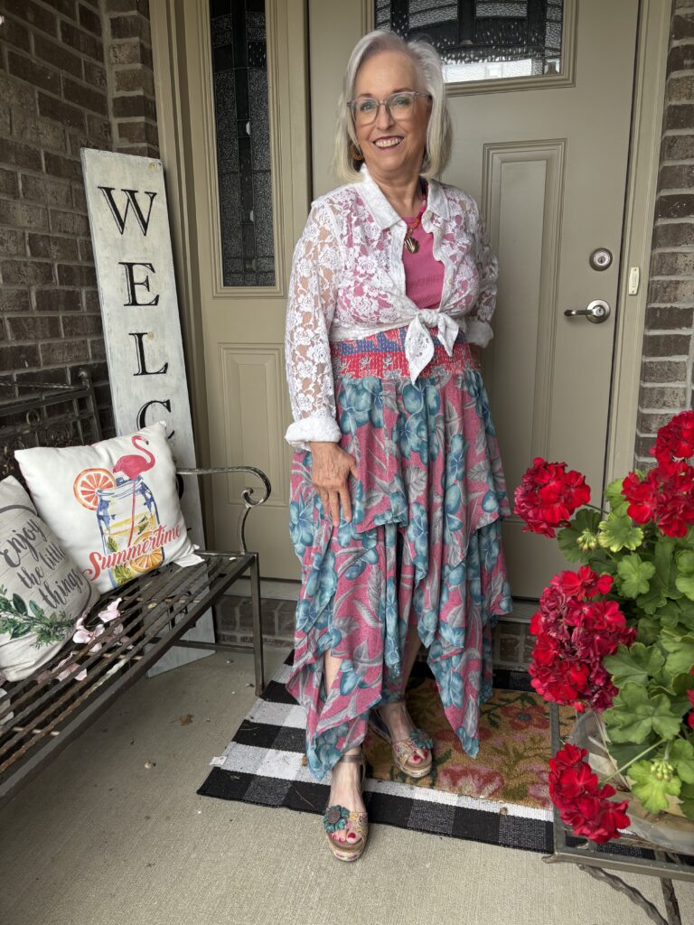
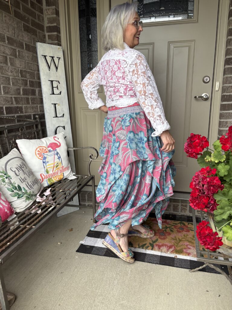
I honestly had no idea what I was going to do with this challenge even as I selected the art! Then, I remembered I’d recently gotten this pink and blue crepe Pixie skirt from Kantha Bae. The colors were perfect. It’s a bear to iron, let me tell you. There are two layers with alternating lengths. And, that silk just slides all over the ironing board. One of the problems with this skirt (well, I’m the problem, but I’ll explain) is that the waistband is soooo long! It’s made from kantha cloth so it could take the elastic smocking at the top. Well, that means it literally comes right up under my boobs! I added one of my favorite sleeveless tees from Old Navy and had the bones of the outfit. Then, I had to figure out what to wear as a completer piece. I tried a white cardigan…nope. Then, I tried my trusty white denim jacket…big old nope! I realized I needed something light, not only in weight but in appearance. I pulled out my trusty white lace blouse from April Cornell. I have been considering getting rid of it, but it comes in handy when I need an extremely lightweight third piece. And, there you have the way this interpretation came together.
The Lewk!
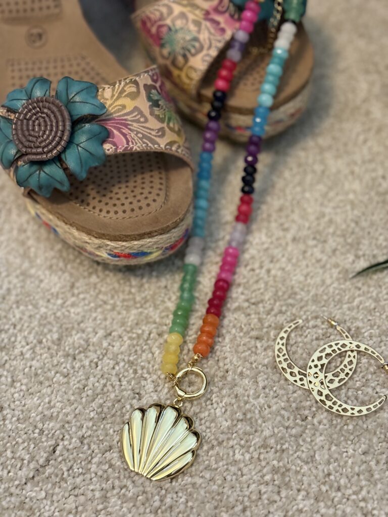


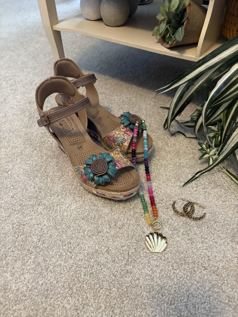
Continuing the pastel theme, I pulled out my Annemarie sandals from L’Artiste. Some of you may remember Jack decided to snack on one a few years ago. That meant I I had to buy a new pair, and I sized up. I really shouldn’t have because these are a titch too big. Luckily, I can adjust them with the straps. When I was looking at my necklaces, I happened to see this one hiding behind another. It’s the perfect necklace for this painting, don’t you think? I think it’s from Allie + Bess. The gold circle at the bottom opens so you can add other charms to it. I really need to do that. The earrings? Hmmm…I think they’re Stella & Dot.
Wrap it up, Marsha!
This is not my favorite outfit for SIA. I love the skirt and think it’s perfect. I need to work at figuring out a different top. The colors are so specific so I might try something completely counterintuitive. But, then will that pull all the attention away from the gorgeous print? So, can we talk? What would you wear with this skirt? What interpretation would you give those colored cherubim? Have you heard the term, High Renaissance before? Please leave me a comment or two, and we can talk. I promise to respond as quickly as I can.
Don’t forget…
If you want to be included in the Style Imitating Art round up, send me your photo by 10:00 pm EST, Tuesday, August 26th. Photos of everyone participating will appear on my blog on Wednesday, August 27th! If you’re interested in joining us, consider all of your options…the colors, the textures, the feelings they evoke, those funny little cherubim! Come on, give it a try! I think you’ll love it!
Thank you!
I want to thank all of you from the bottom of my heart for reading, commenting, subscribing or emailing! It truly means so much to me! If you’d like to follow me on Instagram, you can find me here.
Affiliate links, discount codes, and such:
Just a reminder that Marsha in the Middle may use an affiliate link. Those links are usually italicized. If you click or make a purchase from an italicized link I provide, I may receive a small commission at no cost to you. Thank you for your support. I have a code for April Cornell. It’s a one time use only code so I’d save it for when they have sales. The code is MARSHA15 for $15 off $100. Use Marsha12 for 12% off any order of $65 or more at Buykud. I have also become a Halftee Partner. Use the code, MARSHA2098, for 20% off any purchase. I am also an affiliate with Clara Sunwoo. You can use my code, MARSHA10, for 10% off your entire order. In case you didn’t know, bloggers must disclose the use of affiliate links. That’s why I include this in each post
Where you can find me:
Linking up with Nancy’s Fashion Style, Fine-Whatever, Is This Mutton, Shelbee on the Edge, Chez Mireile, Suzy Turner, and Away from the Blue as well as Deb’s World and A Fresh Cup of Coffee. I also link up with This Blonde’s Shopping Bag, Doused in Pink, I do deClaire, Mummabstylish, Style Splash and Elegantly Dressed and Stylish as well as the Senior Salon Pit Stop (Esme’s Salon) and Slices of Life. Please check out these wonderful ladies and their blogs! I also am a co-host for Ageless Style on the third Thursday of the month and Songful Style on the last Monday of the month. I co-host Traffic Jam Weekend every Thursday with Melynda, Lisa, and Sue. I also host Final Fridays on the last Friday of the month as well as 10 on the 10th on the 10th of the month! I do hope you’ll check out all of these blogs and link parties!
The white blouse works a treat and I love the red Geraniums!
Thanks, Rosie! I love a good white blouse. I am hoping to keep these geraniums over the winter. I have another pot that I kept from last summer. It’s gorgeous, but it sits farther out on the sidewalk.
Oh that is a fabulous skirt! I often have trouble with one fabulous piece like that too that I don’t want to detract from. I think your white blouse looks lovely with it.
Thanks, Joanne! I’m glad you think along the same lines as me. I think something printed or over the top might detract from it. I’m going to play with it some more and see what I can figure out. Who knows? We might be wrong…I doubt it…but you never know!
I love this vibe, Marsha! I mean, considering it’s not one of your favourite SIA looks, I think you did really well! The skirt is absolutely gorgeous!! As are the sandals—shame they’re a little too big though!
Big hugs
Suzy xx
Thanks, Suzy! I love the skirt, but my hair is at a strange look and throws me off when it gets all flat and lifeless. Then, I just feel like everything is wrong. If my hair had been good, I probably would have liked this look. I am going to try to figure out a new way to wear the skirt because I really like it. Luckily, I can tighten the sandals enough. They’re just a titch too long.
I have to admit that I expected darker colors, but this pastel version is really pretty! I like the look!
Thanks, Cat! I was expecting them, too! But, then, I really had to go with the cherubim! They are what stand out to me when I look at this painting. I couldn’t find any explanation for the colors, either, which really bothered me. So, I’m guessing you’ll find out for me?
Why do you already know me so well, lol? I had already started looking when you announced it, but no luck so far. I’ll let you know if I find out anything!
Hahaha!!! I hope you can find an answer. There’s one with all red cherubim which signified something I don’t remember right now. But, if anyone can find it, I know it will be you, Cat!
There are paintings by others that have colorful cherubim and seraphim. Some are completely colored, some just have colored wings.
Here’s one example https://kmska.be/en/masterpiece/madonna-surrounded-by-seraphim-and-cherubim
“The three blue cherubim represent purity and air, the six red seraphim love and fire.”
I did see that one, I think. Or, maybe it was one with all red cherubim. I think what struck me the most about our piece was the pastel colors. They just seems so strange for such a serious (usually) subject. Thanks for the research, Cat! I knew I could count on you!
Well done Marsha! I love the handkerchief hem of your skirt, it’s sassy and shows off your pretty shoes!
xo,
Kellyann
Thank you, Kellyann! You would not believe how much material is in this skirt. The photos don’t really convey that. I loved the print and colors, too.
Marsha, this skirt is amazing, but you need a steamer, my friend! I am sure ironing that was complete tedium. I have had an upright clothing steamer for about a decade and it is definitely one of my most used small appliances. I actually just had to replace mine because it finally died after 10 years. They really come in handy and make dewrinkling my clothing so much easier than an iron. Of course, some fabrics need an iron so I do sometimes bring out the old ironing board, but very rarely. In fact, my iron is probably 25 years old by now and still works! Anyway, that was a massive side note. Ha. This outfit is so pretty and your lacy completer piece is perfect. I struggle with styling voluminous skirts so I don’t have any helpful styling tips. I would wear it just like you have…with something tied at the waist to maintain some shape. Just keep playing around with different tops and I bet you will discover multiple ways to wear this gorgeous skirt!
Shelbee
Thanks, Shelbee! I am definitely going to play around with it (because…shhhhh…I bought two of them). It’s just so pretty. At first, I didn’t like the cotton kantha as the waistband and then realized it needed to be sturdy enough to take the smocking. I have a couple of ideas for it because the colors and print are just gorgeous! I have thought about a steamer, but I honestly don’t have the desire to buy one. Also, I use the iron and ironing board for blocking my knitting and when I sew. If I still lived in the other house, I maybe would get one. I sure do miss all that space!
What a fun outfit!
Thanks so much, Hena!!
I think this outfit turned out great as-is…though as a fellow high-waisted person, I hear you on the height of the waistband. It’s funny that you struggled to interpret your own artwork selection, but you came through!
Hahaha!!! I always think I’ll pick something after I’ve come up with an outfit. Somehow, I never do that. And, it’s more fun challenging myself to hit the brief. The problem with this skirt (though it’s not really that big a problem) is the waistband is about 6-8 inches wide. It’s supposed to be a convertible skirt meaning you could also wear it as a dress. I should give that a shot, right?
Thanks, Sally! It’s so good to have you back!
The lace shirt really pulls it together so well..better not get rid of it, 😂😂
Its like you’re being a docent in your blog posts..exactly why you are perfect for the job
Xoox
Jodie
Thank you, Jodie! I know, I know! It’s been on the edge of donating/consigning so often. Then, I think of how versatile it is. I really need to try it under something. I’ve never done that. Well, I probably will develop a tour around this painting now that I know so much about Bellini. And, it’s in a gallery with several other Madonnas.
Personally, I’d find a top with one of the tan shades in the skirt (and I’d probably roll the top in half – I say that as one who’s becoming shorter and I often roll the waists).
Thanks, Veronica! I did try rolling the top of the skirt (I think that’s what you meant). It was quite bulky because it’s actually smocked cotton. I have to roll waists sometimes, too!
I am always in awe on the amount of research you do on the artists and their work.
You have done well with your outfit here , especially the colours , very Italian. The skirt is just lovely . For a change you could pair it with a light coffee colour or beige.
Thanks, Jill! Oh, I like the idea of a coffee color. That would pick up on the slight hints of it in the skirt. I can’t just write about what I’m wearing so research it is. And, I also love to learn. I really enjoy learning about artists and new movements as well as techniques.
I absolutely adore your interpretation of this work! The colors in your skirt are so similar and I love the use of lace with the skirt. Such a pretty look Marsha!
https://www.kathrineeldridge.com
Thank you so much, Kathrine! I love the skirt, but I need to figure out a different top half for regular wearing. The problem is how wide the waistband is. I could wear it a a dress, too.
Your skirt is the perfect match for this piece of art! Love the layer of lace! Such a pretty look!
Jill – Doused in Pink
Thank you, Jill! I was pretty sure I was going to use this skirt after looking at the art for a couple of days. I’m still not in love with the top half so I’m going to keep experimenting!
Thanks for curating this round of Style Imitating Art. The series sounds like a fun and creative way to find new outfit inspiration. I’m excited to see how everyone interprets the beautiful Madonna and cherubim artwork with their own style.
http://www.benitajames.com
Thank you, Benita! It really is a fun way to create an outfit. I hope you found the Gallery of Style post when I shared everyone’s look.
Pingback:Gallery of Style: Madonna with Child and St. John the Baptist! - Marsha in the Middle
Oh that skirt is so fun! I can see how it would be so tricky to iron though! I would probably try something neutral with it like a black top to make it a focal piece. I see the inspiration in your outfit though especially with the lace top overlay. It reminds me of the clouds a bit.
Thank you, Laura! I actually like to iron because it’s one of the few things in life that gets rid of wrinkles quickly! Oh, a black top might be really striking. I’m going to have to remember that. I was thinking that about the lace top and completely forgot to mention it!
Pingback:Style Imitating Art: Earth and Sky! - Marsha in the Middle
Pingback:Style Imitating Art: Tying Her Shoes! - Marsha in the Middle